x = [0, 1, 2, 3]
y = []2 Linear Regression
2.1 What is Linear Regression?
Linear regression is a type of statistical model that aims to establish the linear relationship between one or more independent variables and a dependent variable. It’s one of the most basic yet powerful techniques in the fields of statistics and machine learning.
2.2 Why Learn Linear Regression?
Versatility: It’s widely used in various domains, including economics, biology, engineering, and more.
Interpretability: The model is relatively straightforward to understand and interpret compared to more complex algorithms.
Foundation: Understanding linear regression can serve as a stepping stone to grasp more complex statistical methods.
Simple linear regression is used to estimate the relationship between two quantitative variables.
You can use simple linear regression when you want to know:
- How strong the relationship is between two variables (e.g., the relationship between rainfall and soil erosion).
- The value of the dependent variable at a certain value of the independent variable (e.g., the amount of soil erosion at a certain level of rainfall).
Regression models describe the relationship between variables by fitting a line to the observed data. Linear regression models use a straight line, while logistic and nonlinear regression models use a curved line. Regression allows you to estimate how a dependent variable changes as the independent variable(s) change.
Example: You are a social researcher interested in the relationship between income and happiness. You survey 500 people whose incomes range from 15k to 75k and ask them to rank their happiness on a scale from 1 to 10. Your independent variable (income) and dependent variable (happiness) are both quantitative, so you can do a regression analysis to see if there is a linear relationship between them.
This model has been borrowed by machine learning for predicting the output.
2.3 The linear function
Under the hood Linear Regression model use the linear function.
A linear function is a mathematical function that models a relationship between two variables in such a way that the output is directly proportional to the input. In simpler terms, if you graph a linear function, it will be a straight line.
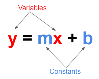
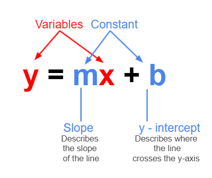
Here, m is the slope of the line, which determines how steep the line is, and b is the y-intercept, which is where the line crosses the y-axis.
The slope m tells you how much y changes for a one-unit change in x. The y-intercept b is the value of y when x=0.
Note: Elsewhere, you may see the above formula written as \(y = mx + c\). The choice between b and c is purely a matter of convention and doesn’t impact the mathematical principles involved.
Some real life examples of when a linear function may be used:
For a phone billing plan with a set monthly fee of £20 and a rate of 5p per minute, your monthly cost y for x minutes would be \(y=0.05x+20\).
A movie streaming service charges a monthly fee of £4.50 and an additional fee of £0.35 for every movie downloaded. Now, the total monthly fee is represented by the linear function \(y = 0.35x + 4.50\), where x is the number of movies downloaded in a month.
Example:
In this scenario, \(y = 3x+1\).
Below, we have a list, x, that contains some elements, and an empty list y.
We can create a for loop to iterate over each element in the list x. In each iteration, ‘value’ will take on one of the values in x. For each value of x, the loop will multiply it by 3 and add one, storing it in variable a. Then, the variable a will be added to the list y. At the end of the loop, y will contain all the values of x with the linear function applied.
for value in x:
    a = value * 3 + 1
    y.append(a)

y
[1, 4, 7, 10]When we plot the values from the example above, we can see that we get a straight line. This is what defines the linear function - we know that whenever we use it, we will get a straight line as an output.
fig, ax = plt.subplots()
ax.plot(x, y, "-o")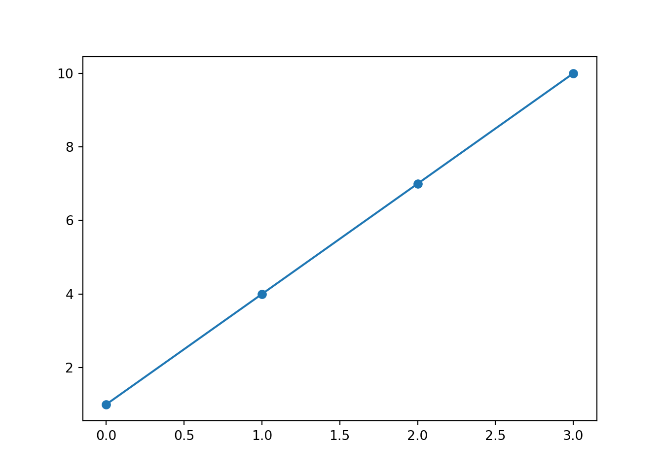
So far, we have established thay y and x are our variables, while m is the slope and b is where the line intercepts the y axis.
But what will happen if we change the constants? Follow this link and see for yourself. You’ll also be able to add a line of best fit and the residuals (we will explore these concepts in greater detail later on).
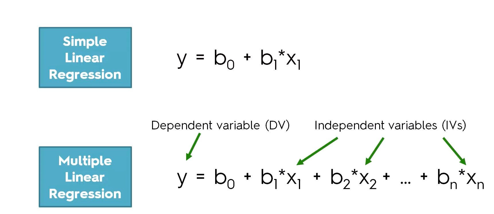
2.4 Simple Linear Regression vs Multiple Linear Regression
The difference between linear regression and multiple linear regression is that linear regression examines the relationship between one predictor and an outcome, while multiple regression delves into how several predictors influence that outcome.
With linear regression, we are just looking at the relationship between two variables - the independent and dependent variables. For example, predicting someone’s height based off their weight.
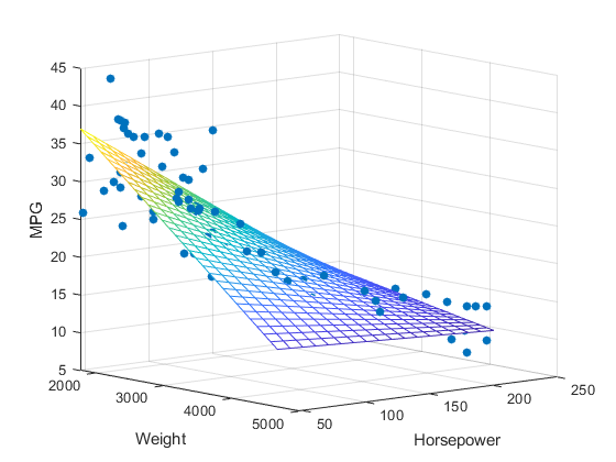
However, with multiple linear regression, we are still predicting one dependent variable but are using multiple independent variables to do so. This will give us multiple slopes, and while the linear regression slope just looks like a 2D line, for multiple linear regression we are looking at a three-dimensional plane. Instead of predicting someone’s height based off their weight, we may also have age, diet, or activity level as another independent variable.
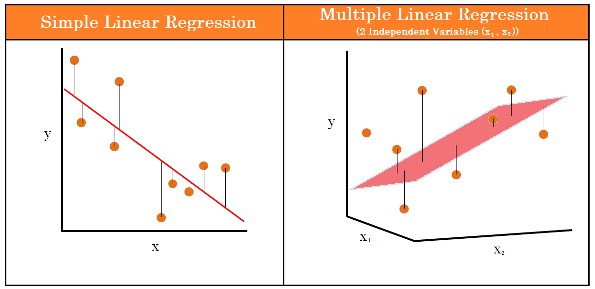
For the diagram below, you can see how multiple linear regression would be displayed on a 3D graph. Here, we are predicting MPG (y axis) using weight (x axis) and horsepower (z axis) as predictors.
Below, you can see the equations for a simple linear regression and a multiple linear regression. The y will always be the dependent variable and the x will always be the independent variables, however many there are.
Dependent and independent variables are also sometimes called response and explanatory variables. Response variables are a type of dependent variable and responds to explanatory variables. Explanatory variables are a tye of independent variable and are what is being manipulated or changed - they explain the results.
2.5 Steps to build, test and validate a model
Now we are ready to build our first model! These are the steps we shall be following:
- Investigate/clean the data
- Define the target and features
- Train-test split
- Create the model
- Evaluate the model
- Validate the model
2.6 Investigate/clean the data
We will be using the diamonds dataset from seaborn.
The dataset has the following columns:
- carat: The weight of the diamond, measured in carats.
- cut: The quality of the diamond cut, with levels including Fair, Good, Very Good, Premium, and Ideal.
- color: Diamond colour, from J (worst) to D (best).
- clarity: A measurement of how clear the diamond is, with levels like I1 (worst), SI2, SI1, VS2, VS1, VVS2, VVS1, IF (best).
- depth: The height of a diamond, measured from the culet to the table, as a percentage of its average girdle diameter.
- table: The width of the diamond’s table expressed as a percentage of its average diameter.
- price: The price of the diamond in US dollars.
- x: Length of the diamond in mm.
- y: Width of the diamond in mm.
- z: Depth of the diamond in mm.
diamonds = sns.load_dataset('diamonds')
diamonds.head()
carat cut color clarity depth table price x y z
0 0.23 Ideal E SI2 61.5 55.0 326 3.95 3.98 2.43
1 0.21 Premium E SI1 59.8 61.0 326 3.89 3.84 2.31
2 0.23 Good E VS1 56.9 65.0 327 4.05 4.07 2.31
3 0.29 Premium I VS2 62.4 58.0 334 4.20 4.23 2.63
4 0.31 Good J SI2 63.3 58.0 335 4.34 4.35 2.75Let’s use .info() to provide a summary of the data. In particular, we want to make sure there are no null values as our model won’t work otherwise!
diamonds.info()<class 'pandas.core.frame.DataFrame'>
RangeIndex: 53940 entries, 0 to 53939
Data columns (total 10 columns):
# Column Non-Null Count Dtype
--- ------ -------------- -----
0 carat 53940 non-null float64
1 cut 53940 non-null category
2 color 53940 non-null category
3 clarity 53940 non-null category
4 depth 53940 non-null float64
5 table 53940 non-null float64
6 price 53940 non-null int64
7 x 53940 non-null float64
8 y 53940 non-null float64
9 z 53940 non-null float64
dtypes: category(3), float64(6), int64(1)
memory usage: 3.0 MB2.7 Define the target and the features
Next, we need to define the target and feature variables - we have to do some preprocessing before the data is ready to use in the model.
- Target is a dependent numerical variable that have to be predicted. Conventionlly this is denoted as
y. For our example, this will be price. - Features are predictors or the independent variables that might influence the target value, denoted as
X. For our example, this wil be all other numerical features in the dataset.
# define the target
X = diamonds[['carat', 'depth', 'table', 'x', 'y', 'z']]
# define the features
y = diamonds['price']
As a side note, it’s worth pointing out that X is in the format of a dataframe, while y is a Series.
The code below will create a scatterplot for each predictor with price, so we can see the relationship between each of them.
import numpy as np
# Create a 2x3 grid of subplots with a shared y-axis.
fig, axes = plt.subplots(2, 3, figsize = (15,10),
                         sharey = True)

# Define the features (variables) we want to plot.
# The array is structured to match the 2x3 grid of subplots.
features = np.array([['carat', 'depth', 'table'],
                     ['x', 'y', 'z']])


# Loop through each subplot row in the grid (indexed by m)
for m, ax in enumerate(axes):
    # Loop through each subplot column in the grid (indexed by n)
    for n, subax in enumerate(ax):
        # Create a scatter plot in the corresponding subplot.
        sns.scatterplot(
            data = diamonds,
            x = features[m][n],
            y = 'price',
            ax = subax,
            alpha = 0.5
            )
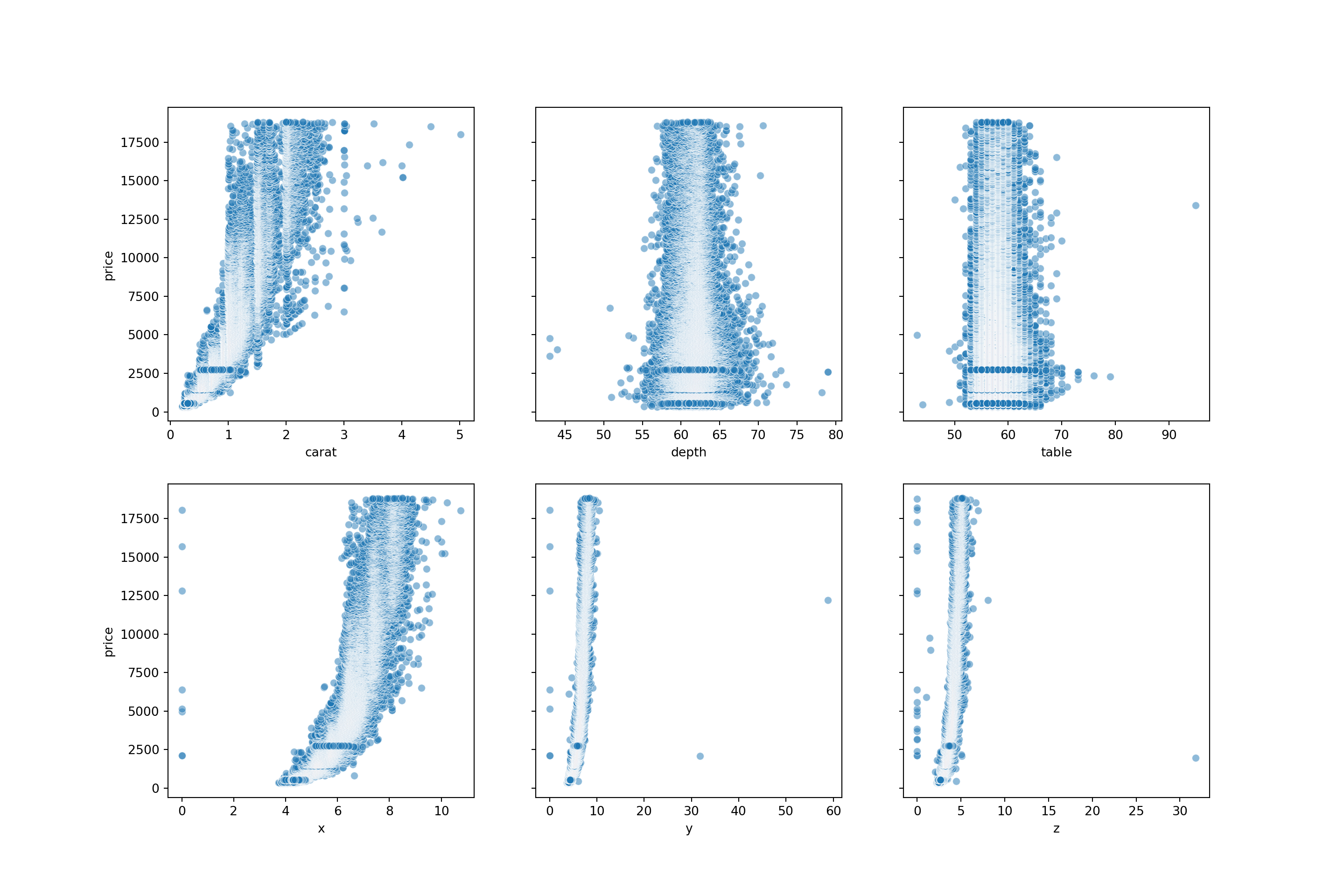
From the scatterplots, we can see there is a strong relationship between price and carat. Price with x is also relatively strong. Depth, table, y and z have weak correlations with price.
Let’s view the correlation metrics of each of the numeric values in the diamonds dataset. This visualises the above but in numerical format.
diamonds_numerical = diamonds.select_dtypes(include=['float64', 'int64']).corr()
diamonds_numerical
carat depth table price x y z
carat 1.000000 0.028224 0.181618 0.921591 0.975094 0.951722 0.953387
depth 0.028224 1.000000 -0.295779 -0.010647 -0.025289 -0.029341 0.094924
table 0.181618 -0.295779 1.000000 0.127134 0.195344 0.183760 0.150929
price 0.921591 -0.010647 0.127134 1.000000 0.884435 0.865421 0.861249
x 0.975094 -0.025289 0.195344 0.884435 1.000000 0.974701 0.970772
y 0.951722 -0.029341 0.183760 0.865421 0.974701 1.000000 0.952006
z 0.953387 0.094924 0.150929 0.861249 0.970772 0.952006 1.0000002.8 Train - Test split
Now is the moment we will be splitting our data.
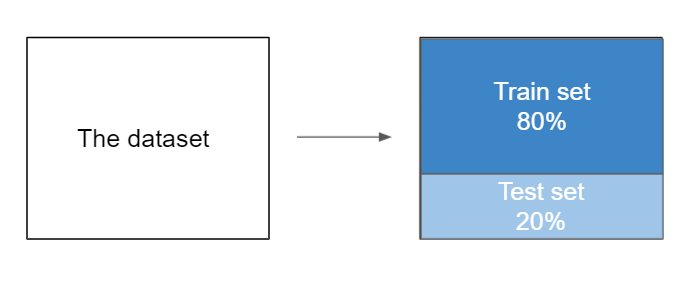
We can test the quality of our model by splitting the dataset into 2 parts: - the training set: contains the main part of the data (80%) - the test set: contains the rest of the data from the whole (20%)
The train set is used to train the model - this means finding the model that best approximates the training set. This is the most computationally intensive process.
The test set is used to predict the values - predict the target value for an instance by plugging features into the trained model. This process is computationally cheap.
Then we can compare the train and test score.
Note:
An 80:20 split is the most common way of spltting the data, however, anything from 90:10 to 50:50 is used in practice. There’s no particular guidance on what you should use - the 80:20 split comes from the Pareto Principle, but this is just a rule of thumb. If the dataset is relatively small, you could have a 70:30 split as this might provide a more representative test set, but you will have a slightly smaller training sample. If the model is particularly complex, you could have an 80:20 split to provide more training data and in turn help the model generalise better.
When in doubt - just use the 80:20 split.
The scikit-Learn library provides us with a function named train_test_split(). This function helps us to divide the dataset into two subsets for model training and model testing.
We will become very acquainted with scikit-learn over the course of the module - we will use it for all of our ‘shallow’ algorithms. (Algorithms that don’t have hidden layers, for example neural networks)
This function will shuffle all the dataset rows randomly, and then it will perform the splitting. The function returns 4 outputs in the following order: - a dataset with the features for training - a dataset with the features for testing - the target values for training (the model knows them) - the target values for testing (the model doesn’t know them)
# import train_test_split from the sklearn library
from sklearn.model_selection import train_test_split

X_train, X_test, y_train, y_test = train_test_split(X, y, test_size=0.2, random_state=2023)
X_train, X_test, y_train, y_test
( carat depth table x y z
48240 0.86 63.2 61.0 6.05 5.97 3.79
20250 1.51 65.0 59.0 6.99 7.07 4.57
34895 0.33 61.9 55.0 4.44 4.48 2.76
33899 0.30 62.0 55.0 4.31 4.27 2.66
29466 0.32 62.0 55.0 4.36 4.38 2.71
... ... ... ... ... ... ...
38620 0.31 63.1 57.0 4.27 4.32 2.71
38817 0.39 62.5 54.0 4.70 4.67 2.92
51895 0.73 62.8 55.0 5.73 5.76 3.61
47558 0.70 62.3 55.0 5.67 5.72 3.55
22041 0.31 62.8 55.0 4.35 4.31 2.72
[43152 rows x 6 columns], carat depth table x y z
25388 2.02 56.5 61.0 8.33 8.37 4.72
15396 1.12 61.6 56.0 6.69 6.71 4.13
35778 0.32 62.1 54.0 4.41 4.42 2.74
3379 0.31 61.3 58.0 4.34 4.37 2.67
45160 0.50 60.7 61.0 5.12 5.09 3.10
... ... ... ... ... ... ...
36438 0.31 61.7 55.0 4.40 4.35 2.70
50067 0.70 61.6 56.0 5.69 5.71 3.51
29605 0.35 61.4 54.0 4.54 4.58 2.80
19050 1.59 61.6 57.0 7.51 7.56 4.64
2543 0.58 60.6 57.0 5.38 5.41 3.27
[10788 rows x 6 columns], 48240 1950
20250 8681
34895 880
33899 844
29466 702
...
38620 489
38817 1047
51895 2431
47558 1874
22041 628
Name: price, Length: 43152, dtype: int64, 25388 14080
15396 6168
35778 912
3379 408
45160 1654
...
36438 942
50067 2202
29605 706
19050 7835
2543 3206
Name: price, Length: 10788, dtype: int64)To summarise the code block above:
X and y are our features and labels. X contains the input variables, and y contains the output variable.
test_size = 0.2 specifies that we are setting aside 20% of the data for testing, while the remaining data will be used for training.
random_state = 2023 is for reproducibility - setting a random state ensures that the random data shuffling will produce the same result each time you run the code.
2.9 Model Creation
Now we can begin to create the model. First of all, we will need to import the class LinearRegression from the sklearn.linear_model library.
from sklearn.linear_model import LinearRegressionAfter, we will create just an empty model which only contains the core model and nothing else.
# create the model
model = LinearRegression()
The bare bones of our model have been created now. The second step is to fit the model to the data, and to do this we will be using the function fit.
Inside this function, we will input the features (X_train) and the corresponding target variables (y_train).
When we run this code, what the model does it use the feature and target data to learn the best possible linear relationship that predicts the target y_train based on the features X_train.
# fit the model to the training data
model.fit(X_train, y_train)LinearRegression()In a Jupyter environment, please rerun this cell to show the HTML representation or trust the notebook.
On GitHub, the HTML representation is unable to render, please try loading this page with nbviewer.org.
LinearRegression()
We can also view the slope by using model.coef_. This attribute holds the values of the coefficients (also known as weights or parameters) that the model has learned for each feature variable during the training process.
In the equation \(y=mx+c\), m is the coefficient for the feature x. As we have six features, our equation will look more like
\[y = m_{1}.x_{1} + m_{2}.x_{2}+ m_{3}.x_{3}+ m_{4}.x_{4}+ m_{5}.x_{5}+ m_{6}.x_{6} + c\]
Running model.coef_ gives us our 6 coefficients, each telling you the ‘impact’ of those features on the target variable. These correspond to carat, depth, table, x, y and z.
# the slope
model.coef_
array([10588.39978392, -205.29927532, -102.52085196, -1295.18511393,
60.52687981, 76.98527858])We can also view the intercept of the model using model.intercept. This gies you the value of the intercept, c, in our linear model equation.
The intercept helps you to calibrate the model to our data, shifting the regression line up or down to best fit the distribution of points.
# the intercept
model.intercept_20854.58196699316We can plug in these values into our linear equation, as we have the coefficient (m), the intercept (c), and we can use the first row of values in the diamonds dataset as our x values.
# view the first row of the data:
diamonds.head(1)
carat cut color clarity depth table price x y z
0 0.23 Ideal E SI2 61.5 55.0 326 3.95 3.98 2.43# the linear function:
price = (10588.39978392 * 0.23) - (205.29927532 * 61.5) - (102.52085196 * 55) - (1295.18511393 * 3.95) + (60.52687981 * 3.98) + (76.98527858 * 2.43) + 20854.581966992955
price337.3516358842571Our model has calculated the price as £337.35; however, in the dataset we can see the actual price is £326. We’re not too far off, but not exact! We will look at how we can improve our model further down the line.
Thankfully, we don’t need to calculate the linear function for each row of the X_test dataset by hand. We can use our trained linear regression model to make predictions on the test dataset, and returns an array of these predicted values.
# make predictions on the new data
predicted_prices = model.predict(X_test)
predicted_prices
array([14471.05700557, 6385.28280772, 724.36101459, ...,
1031.6518535 , 10287.9684007 , 2322.12556366])2.10 Evaluate the model
2.10.1 R squared
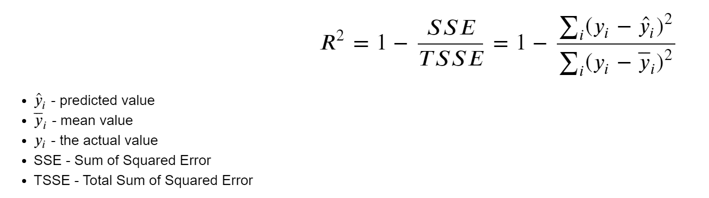
We can also compute the score of the model, called the \(R^2\) metric or the coefficient of determination.
This coefficient shows the “goodness of fit” and it tells us how much of the data can be explained by the model. And also it shows how our model performs comparing with a baseline model.
The \(R^2\) value ranges from 0 to 1:
If\(R^2\) = 1: Our model perfectly predicts the data. Every observed value matches the model’s prediction.
If \(R^2\) = 0: Our model is no better than simply predicting the mean for every data point.
If \(R^2\) is negative: It implies our model is performing worse than the baseline, which usually means there might be something fundamentally wrong with the model or data.
2.10.2 Interpreting R squared
High \(R^2\) value (>0.7): Indicates that the model explains much of the variability of the target variable.
Moderate \(R^2\) value (0.5-0.7): Suggests the model explains a moderate amount of variability. Consider feature engineering or using a more complex model.
Low \(R^2\) value: (<0.5): The model does not fit the data well. You may need to revisit your features or consider a different kind of model.
While a higher \(R^2\) value generally suggests a better fit, it is not the only metric to evaluate your model’s performance.
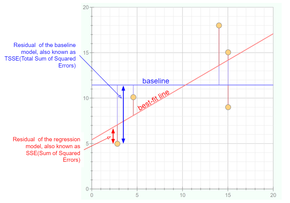
The graph below helps us to visualise how much a best-fit line can differ to a simple baseline model.
Data Points (yellow circles): These are observed values from our dataset.
Baseline (blue line): Represents a simple model - often the mean or median of our dependent variable. It’s the value we’d predict without any other information. You could consider it our “if we know nothing” guess.
Best-Fit Line (red line): This line is produced by our linear regression model. It’s what our model predicts for each given value of our independent variable.
Residuals:
Residual of the baseline model: The vertical distance (blue arrows) between the data points and the baseline. This helps us understand how much error we’d have if we simply guessed the same value (i.e., the mean) for every point.
Residual of the regression model: The vertical distance (red arrows) between the data points and our best-fit line. These residuals are hopefully smaller than the baseline residuals, indicating our model is making more accurate predictions.
Error Squared:
TSSE (Total Sum of Squared Errors for the baseline): This is the sum of the squares of the blue residuals. It represents the total error if we used the baseline to make our predictions.
SSE (Sum of Squared Errors for the regression model): This is the sum of the squares of the red residuals. Ideally, this value should be much smaller than the TSSE, indicating our regression model is a good fit.
Here, we can see the formula that is being used to calculate \(R^2\).
\(\hat{y}_i\) (y hat): represents the predicted value from our linear regression model for a given data point.
\(\bar{y}_i\) (y bar): the mean value of our dependent variable. Essentially, if we were to predict the average value for every data point, this is the value we’d use.
\({y}_i\): represents the actual observed value for a given data point in our dataset.
SSE (Sum of Squared Error): this is the sum of the squared differences between each observed value and its corresponding predicted value. Mathematically, it’s represented by \(\sum (y_i - \hat{y}_i)^2\).
TSSE (Total Sum of Squared Error): this is the sum of the squared differences between each observed value and the mean value of the dependent variable. Mathematically, it’s represented by \(\sum (y_i - \bar{y}_i)^2\).
Then, we can use the \(R^2\) formula. The idea behind it is to assess how much of the variability in our data is captured by our regression model compared to a simple baseline model (the mean). By taking the ratio of SSE to TSSE and subtracting it from 1, we get a value between 0 and 1, which is then our \(R^2\) metric.
 Now that we understand some of the theory behind \(R^2\), we can implement this on our model for the diamonds dataset.
# R_squared for training dataset
model.score(X_train, y_train)0.8582959744536787# R_squared for test dataset
model.score(X_test, y_test)0.8628896236791447So, we have a \(R^2\) score of 85.8% for the training dataset and 86.3% for the test dataset. As our scores are above 0.7, we could say that the model has good fit to the data. Also, as the scores are quite similar, our model is performing consistently across both datasets. it’s not overfitting to the training data, which would be indicated by a high training score and a lower test score.
# predicting the prices for the diamonds from the test dataset
y_predicted = model.predict(X_test)
y_predicted
array([14471.05700557, 6385.28280772, 724.36101459, ...,
1031.6518535 , 10287.9684007 , 2322.12556366])import pandas as pd
test_values = pd.DataFrame(y_test)
test_values price
25388 14080
15396 6168
35778 912
3379 408
45160 1654
... ...
36438 942
50067 2202
29605 706
19050 7835
2543 3206
[10788 rows x 1 columns]2.10.3 Errors
Besides the score(coefficient of determination), we have another metric based on the model errors. The error metric quantifies how inaccurate our predictions were compared to the actual values. We can compute it by calculating the difference between each predicted and actual value and then averaging these differences.
What we will do now is create a dataframe where we will store the vales for y_test. We will then add the y_predicted values to the dataframe, stored in a column with the same name. Then, we compute the absolute error between the predicted values and the actual values. Note it is the absolute error - it is the magnitude of the difference between the actual and predicted values, irrespective of their sign.
# create new df
test_values = pd.DataFrame(y_test)
# add y_predicted values to dataframe
test_values['y_predicted'] = y_predicted
test_values price y_predicted
25388 14080 14471.057006
15396 6168 6385.282808
35778 912 724.361015
3379 408 454.880674
45160 1654 1348.732276
... ... ...
36438 942 603.711433
50067 2202 3125.082260
29605 706 1031.651854
19050 7835 10287.968401
2543 3206 2322.125564
[10788 rows x 2 columns]# calculating the difference between each predicted and actual value
test_values['error'] = np.absolute(test_values['y_predicted'] - test_values['price'])
test_values price y_predicted error
25388 14080 14471.057006 391.057006
15396 6168 6385.282808 217.282808
35778 912 724.361015 187.638985
3379 408 454.880674 46.880674
45160 1654 1348.732276 305.267724
... ... ... ...
36438 942 603.711433 338.288567
50067 2202 3125.082260 923.082260
29605 706 1031.651854 325.651854
19050 7835 10287.968401 2452.968401
2543 3206 2322.125564 883.874436
[10788 rows x 3 columns]Finally, we compute the mean of the absolute errors.
# calculating MAE
test_values['error'].mean()880.7236831894945This metric is called the mean absolute error or MAE.
So we have a figure of 880.72 - but what does that mean?
MAE measures the average magnitude of the errors in a set of predictions, without considering their direction. This figuremeans that on average, our model’s predictions are off by about 880 units, whatever those units might be. However, the context of the data is important. If we were predicting house prices and the price ranged from £100,000 to £1,000,000, then a MAE score of 880 would be seen as a very good score. If we were predicting the prices of inexpensive items like books which ranged from £5 to £50, then a MAE score of 880 would be terrible and we’ve probably gone very wrong somewhere!
In the context of the diamonds dataset, it means that, on average, our model’s predictions on diamond prices are off by £880. Given the diverse price range in the dataset, a MAE of £880 can be seen as a moderate error. For cheaper diamonds (e.g., those in the lower quartiles), an error of £880 could be quite significant. For more expensive diamonds (e.g., in the higher quartiles), this error might be less impactful relative to the overall price.
We can also implement MAE in scikit-learn.
# The mean absolute error or MAE
from sklearn.metrics import mean_absolute_error

# calculating MAE using sklearn
mean_absolute_error(y_test, y_predicted)880.72368318949452.10.4 MSE
To see if we have too big errors, we can “penalise” the predicted values further away from the actual value. We can do this by squaring the error values and then take their mean. Thus, a low error metric means that the difference between the predicted list of prices and the actual price values is small, while a high error metric means the difference between the predict and the real value is big. It also means that larger errors have a disproportionately large impact on the MSE.
# The mean squared error or MSE
from sklearn.metrics import mean_squared_error

mean_squared_error(y_test, y_predicted)2167131.37270022This means that for our dataset, we have the squared difference between the actual diamond prices and the predicted prices by your model is 2,167,131 (in squared pounds). The problem with this metric is that it isn’t really interpretable. Pounds squared isn’t very useful to us, so we need to get back to something which we can interpret but still keep the penalisation of the outliers. This is why the root mean squared error, or RMSE, exists. RMSE is a quadratic scoring rule that also measures the average magnitude of the error. Using scikit-learn, we use the same function as we do to calculate the MSE, but we add a parameter squared = False.
2.10.5 RMSE
# The root mean squared error or RMSE
mean_squared_error(y_test, y_predicted, squared = False)
1472.1179887156532
C:\Users\GEORGI~1\AppData\Local\Programs\Python\PYTHON~1\Lib\site-packages\sklearn\metrics\_regression.py:483: FutureWarning: 'squared' is deprecated in version 1.4 and will be removed in 1.6. To calculate the root mean squared error, use the function'root_mean_squared_error'.
warnings.warn(2.10.5.1 MAE vs RMSE
Units of Interest: Both MAE and RMSE express the average model prediction error in the original units of the variable of interest. For example, if we’re predicting diamond price, both the MSE and RMSE wil be in terms of currency. For the cars datasey, it will be in mpg.
Range: Both the MAE and RMSE can range from 0 to \(+∞\). An MAE or RMSE of 0 would indicate a perfect fit to the data. In reality, a value of 0 is almost impossible, but closer the value is to 0, the better the model is at predictions.
Orientation: Both metrics are negatively-oriented, meaning that lower values are indicative of a better model fit. This is because they both measure ‘error’, and a smaller error implies a better predictive model.
BUT
- RMSE gives a relatively high weight to large errors. This means RMSE might be more useful when large errors are undesirable.
This website gives a good summary of MAE, MSE and RMSE.
2.11 Model Validation
At this point, we have defined the target and features, created the model and evaluated the model by computing the errors. Now, we need to validate the model. When we randomly split our dataset into train and test datasets, we may get a test sample containing a lot of noise (outliers) that will worsen the model. But the sample may have some very relevant data that will make the model perform better.
We need a model that can generalise well on the new data.
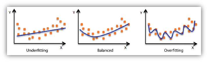
2.11.1 Check for underfitting and overfitting
When we build models, it’s essential to be aware of two common pitfalls: overfitting and underfitting.
Overfitting happens when our model learns the training data too closely, even its noise. While it might perform brilliantly on this training data, it can struggle with new data because it’s learned too many specifics and not enough general patterns.
On the flip side, underfitting is when our model is too simple, missing out on important patterns altogether. This causes it to perform poorly on both training and new data.
So, our goal is to find the sweet spot between the two. A good model should capture the genuine patterns in our data without getting caught up in the noise.
2.11.2 K-fold Cross Validation
Due to the randomness, different samples can have different scores. In order to get a more general value of the score and avoid the bias from the randomness we can perform K-fold Cross Validation.
In this image, the two colours represent data split into training and validation sets. The blue bars represent the training set, and the yellow bars represent the validation set. Validation accuracies, like 93% in Round 1, indicate model performance for each round. The model’s overall performance is represented as the average accuracy across all rounds.
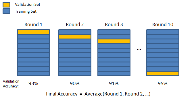
We can see this in action by importing cross_val_score from sklearn.
from sklearn.model_selection import cross_val_scoreThen we can run cross validation on the model, specifying the model we created earlier, the features, and target. We also use cv = 5 to specify we are splitting the data in to 5 subsets and scoring = 'r2' indicated we are using the R squared metric to evaluate model performance. We can then print the R squared scores for the 5 validation folds, as well as the mean and the standard deviation of the scores.
# run cross validation on the model
scores = cross_val_score(model, X, y, cv = 3, scoring = 'r2')print(scores)[-0.03823612 0.6848899 -0.27608988]print('Mean:', scores.mean())Mean: 0.12352129776316649print('Std:', scores.std())Std: 0.4086519550257994We have a negative mean (-0.66) - this indicates that our model is actually performing worse than a the baseline model (just a horizontal line). It means that randomly, some of the samples are so bad that they look very different from the current data and the model can’t predict these scores very well. When we do this validation, we are aiming for a mean that is the general score of the model rather than a score for a specific set. The high standard deviation also shows the model’s inconsistency. This could be due to various reasons, such as the model being too simple (underfitting) or there being outliers in the data that the model struggles with.
2.12 Correlation and Covariance
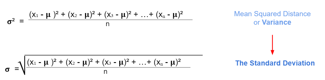
2.12.1 Variance
In the statistics module, we learned about variance \(\sigma^2\) as a measure of spread for continuous variables from its mean value. For the standard deviation, we just take the square root of the variance.
Example: Here we have a small data about monthly ice cream sales for a small ice cream vendor.
| Month | Amount |
|---|---|
| January | 100 |
| February | 200 |
| March | 300 |
| April | 500 |
| May | 900 |
# values from the table in a list
amount = [100, 200, 300, 500, 900]print('The amount mean:', np.mean(amount))The amount mean: 400.0print('The amount variance:', np.var(amount))The amount variance: 80000.0print('The amount standard deviation:', np.std(amount))The amount standard deviation: 282.8427124746192.12.2 Covariance
Covariance is a measure of two joint variable variances. Suppose the greater values of one variable mainly correspond with the greater values of the other variable, and the same is for the lesser values. In that case, these variables tend to show similar behaviour. Thus, we will say that our covariance is positive.
The formula for covariance:
\[\sigma_{XY} = \dfrac{(x_1 -\mu_x)(y_1 - \mu_y) + (x_2 -\mu_x)(y_2 - \mu_y) + ... + (x_n -\mu_x)(y_n - \mu_y)}{n}\]
The x and y values in this formula are the individual data points in the dataset, while \(\mu_x\) and \(\mu_y\) are the means of datasets X and Y. Summing up these products across all data points gives the combined variability for all data points, and dividing by n (the number of data points) gives the average joint variability, which is the covariance.
Example: Suppose we have data for 3 ice-cream vendors instead of 1. We would like to see if Vendor A and Vendor B have similar sales across the year. We want to check the same thing for Vendor A and Vendor C, and Vendor B and Vendor C. The covariance formula requires us to have of the same number of values for each variable.
sales = pd.DataFrame([['January',100, 220, 900],
             ['February', 200, 400, 800],
             ['March',300, 600, 500],
             ['April', 500, 900, 1400],
             ['May',900, 1300, 2000]
             ], columns = ['month', 'vendor_a', 'vendor_b', 'vendor_c'])
sales
month vendor_a vendor_b vendor_c
0 January 100 220 900
1 February 200 400 800
2 March 300 600 500
3 April 500 900 1400
4 May 900 1300 2000Then, we can use the .cov() function in numpy to calculate the covariance between vendors A, B and C, making sure to only select the numerical columns.
The parameter ddof = 0 stands for delta degrees of freedom and calculates the covariance using the formula for the entire dataset. If you just wanted to calculate the covariance for a sample of the dataset, you would use ddof = 1.
# calculate covariance
sales = sales[['vendor_a', 'vendor_b', 'vendor_c']]
sales.cov(ddof=0)
vendor_a vendor_b vendor_c
vendor_a 80000.0 106800.0 132000.0
vendor_b 106800.0 145824.0 169520.0
vendor_c 132000.0 169520.0 277600.02.13 Pearson Correlation coefficient (r)
Pearson’s Correlation Coefficient, often represented as \(r\), provides a measure of the strength and direction of a linear relationship between two variables.
It ranges from -1 to 1, with -1 indicating a perfect negative linear relationship, 1 indicating a perfect positive linear relationship, and 0 suggesting no linear relationship.
At its core, covariance measures how two variables change together. However, it lacks a standardised scale, making it difficult to interpret on its own. Pearson’s Correlation is essentially a normalised version of covariance. By dividing the covariance of the two variables by the product of their standard deviations, we obtain the correlation coefficient, which gives us a clearer, scaled indication of the relationship strength.
\[r = \frac{\sigma_{XY}}{\sigma_X \sigma_Y} \]
We can compute the correlation coefficient using .corr() from pandas.
# correlation coefficient
sales.corr()
vendor_a vendor_b vendor_c
vendor_a 1.000000 0.988808 0.885766
vendor_b 0.988808 1.000000 0.842552
vendor_c 0.885766 0.842552 1.000000This looks good but a heatmap would be even better, as we will be able to see the strength of the correlations between each vendor at a glance.
# create a heatmap for the correlation coefficients
sns.heatmap(sales.corr(),
            cmap='coolwarm',
            annot=True,
            fmt=".2f",
            vmin=-1,
            vmax=1);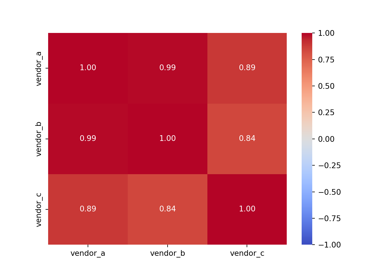
A summary of the parameters used: - cmap='coolwarm' specifies the colour map for the heatmap. The ‘coolwarm’ cmap is a diverging colourmap that transitions between cool and warm colours. More colourmaps available here - annot=True indicates whether or not the values should be written on each cell of the heatmap. Setting it to True will annotate the heatmap with the actual correlation values. - fmt=".2f" determines the string formatting code for annotations. Here, “.2f” means that the numbers will be formatted to show two decimal places. - vmin=-1 sets the minimum value on the colour scale. Since Pearson’s correlation coefficient ranges from -1 to 1, this ensures that -1 will be the minimum value represented in the heatmap. The same applies for vmax=1.
Vendor A and Vendor B have the strongest correlation at 0.99, and Vendor B and Vendor C have the weakest correlation at 0.84 (which is still very strong!).
Let’s explore the diamonds dataset in the same way.
# heatmap for the diamonds dataset
sns.heatmap(diamonds_numerical.corr(),
            cmap='coolwarm',
            annot=True,
            fmt=".2f",
            vmin=-1,
            vmax=1);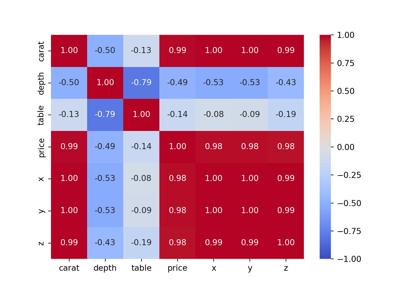
2.14 Linear and non-linear relationships
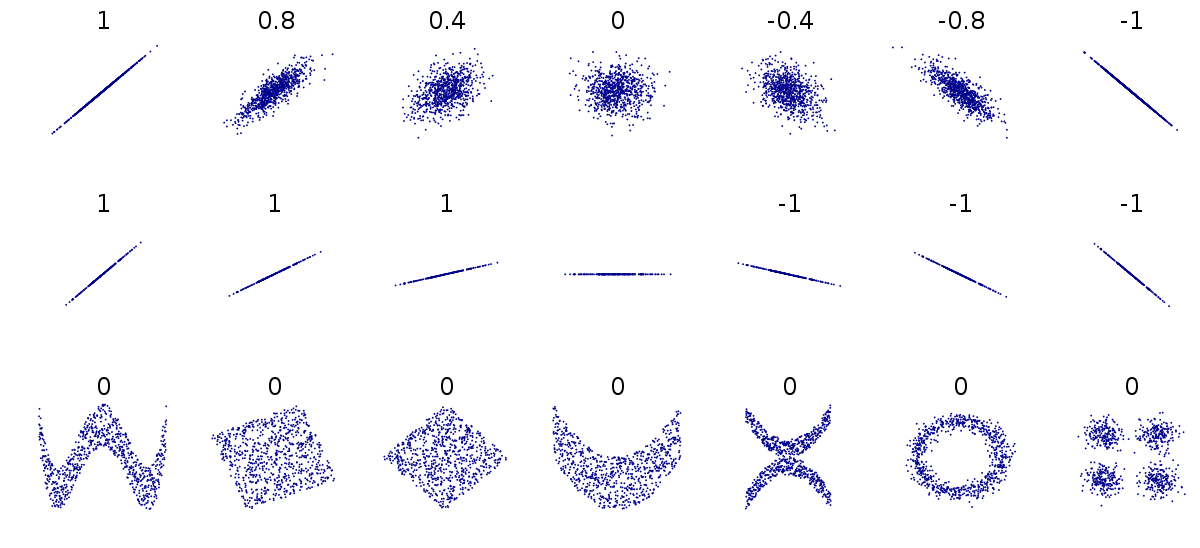
Let’s briefly mention the difference between linear and non-linear relationships. As we have just discovered, the values for Pearson’s correlation coefficient range between 1 and -1.
On the top row of the below image, we have a range of linear relationships, from strong positive (1) to strong negative (-1). The closer to 0 the coefficient is, the more spead out the data points are. The middle row contains more examples of perfect positive and negative lineae relationships, while the bottom row demonstrates that although there may be a relationship between points, their correlation coefficient is 0 as they don’t have a linear relationship.
2.15 Correlation is not causation
Causation is when any change in the value of one variable leads to a change in the value of another variable, which means one variable causes the change in another. In other words, they have a cause-effect relationship.
Check this website for some insane correlations: https://www.tylervigen.com/spurious-correlations
So we cannot draw a conclusion based just on correlation, this should be just the first step. We should take time to find other underlying factors, verify if they are correct and then conclude.
2.16 Improving the Linear Regression Model
2.16.1 The problem of multicollinearity
Multicollinearity is when independent variables in the regression model are highly correlated. Due to this, the change in one variable would cause change to another, so the model results fluctuate significantly. Therefore, the model results will be unstable and vary greatly, given a slight change in the data or model.
we cannot rely on the estimated coefficients the unstable nature of the model can cause over-fitting So, when selecting the features in our model, we have to ensure that there is no multicollinearity.
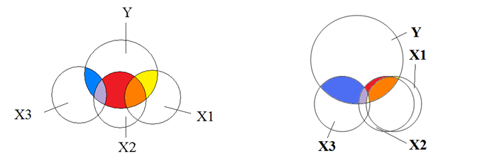
No multicollinearity, where the overlaps indicate correlation - each circle represents an independent variable contributing unique information to the dependent variable, for example house prices and different predictors:
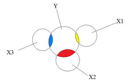
Moderate and extreme collinearity, again where overlaps indicate correlation - each circle provides overlapping information when predicting the independent variable Y:
Our task will be to reduce the multicollinearity, and get rid of the predictors that intersect too much with each other. One method to do this is by checking the Pearson correlation coefficient.
2.16.2 Reduce the multicollinearity by checking the Pearson coefficient
We can create a heatmap of the diamonds dataset, to show the correlation between each variable.
# creating a heatmap
plt.figure(figsize=(8, 8))
diamonds_numerical = diamonds.select_dtypes(include=['float64', 'int64'])
sns.heatmap(diamonds_numerical.corr(), annot=True,cmap='RdYlGn',square=True)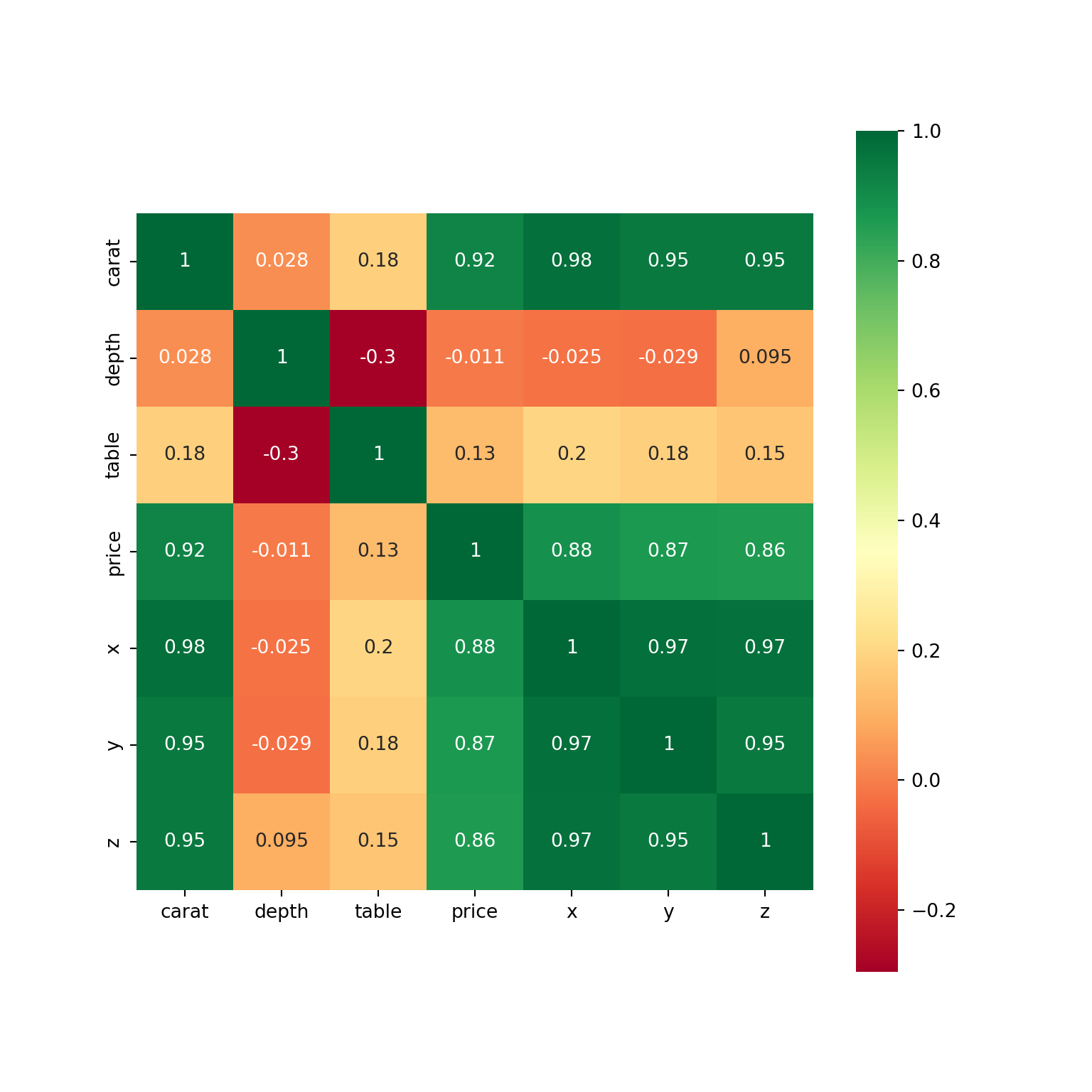
We can also visualise this as a dataframe.
corr_table = diamonds_numerical.corr()
corr_table
carat depth table price x y z
carat 1.000000 0.028224 0.181618 0.921591 0.975094 0.951722 0.953387
depth 0.028224 1.000000 -0.295779 -0.010647 -0.025289 -0.029341 0.094924
table 0.181618 -0.295779 1.000000 0.127134 0.195344 0.183760 0.150929
price 0.921591 -0.010647 0.127134 1.000000 0.884435 0.865421 0.861249
x 0.975094 -0.025289 0.195344 0.884435 1.000000 0.974701 0.970772
y 0.951722 -0.029341 0.183760 0.865421 0.974701 1.000000 0.952006
z 0.953387 0.094924 0.150929 0.861249 0.970772 0.952006 1.000000The first step would now be to check the strongest predictors for price. So from the dataframe, we want to select the price column and compare all of the correlations. You could just look at the dataframe above, but if you want to single out the price column:
# add in .abs() to find the absolute values

corr_table['price'].abs().sort_values(ascending = False)
price 1.000000
carat 0.921591
x 0.884435
y 0.865421
z 0.861249
table 0.127134
depth 0.010647
Name: price, dtype: float64Next we want to check the correlations of the strongest predictor - from the line of code above it looks like the strongest predictor is carat.
corr_table['carat'].abs().sort_values(ascending = False)carat 1.000000
x 0.975094
z 0.953387
y 0.951722
price 0.921591
table 0.181618
depth 0.028224
Name: carat, dtype: float64The x, y and z columns have very strong positive correlations so we will exclude them from our list of features.
# printing the list of columns in the diamonds dataset
diamonds.columns
Index(['carat', 'cut', 'color', 'clarity', 'depth', 'table', 'price', 'x', 'y',
'z'],
dtype='object')# defining the model from the last notebook but with x, y, z missing
X = diamonds[['carat', 'depth', 'table']]
y = diamonds['price']
X_train, X_test, y_train, y_test = train_test_split(X, y, test_size=0.2, random_state = 2023)
model = LinearRegression()
model = model.fit(X_train, y_train)Now let’s evaluate the model. Here, we will be predicting y_test based on the values for X test. Them we can find the R squared and the errors for both the training data and the test data. The values that are commented out are what we had in our baseline model.
y_predicted = model.predict(X_test)

# Train r2 = 0.8582959744536787
# Test r2 = 0.8628896236791448
# MAE = 880.7236831894986
# RMSE = 1472.1179887156522


print('Train r2 =', model.score(X_train, y_train))
Train r2 = 0.85303349349134print('Test r2 =', model.score(X_test, y_test))Test r2 = 0.8562587494939331print('MAE =', mean_absolute_error(y_test, y_predicted))MAE = 984.0692462193138print('RMSE =', mean_squared_error(y_test, y_predicted, squared = False))RMSE = 1507.2946845361082
C:\Users\GEORGI~1\AppData\Local\Programs\Python\PYTHON~1\Lib\site-packages\sklearn\metrics\_regression.py:483: FutureWarning: 'squared' is deprecated in version 1.4 and will be removed in 1.6. To calculate the root mean squared error, use the function'root_mean_squared_error'.
warnings.warn(We have a slightly smaller R squared value, but the errors are larger. What could this mean?
As a reminder: an R squared value closer to 1 indicates that a model perfectly predicts the data. Every observed value matches the model’s prediction. As our R squared value is slightly higher than when using more features, this suggests the additional features (x, y, z) are providing some sort of addiitonal information that helps explain the variance in the price of the diamonds - even if the improvement is only small.
Both MAE and RMSE are measures of prediction error. MAE measures the average magnitude of the errors in a set of predictions, without considering their direction. RMSE measures the square root of the average of squared differences between prediction and actual observation. When you use more features, both MAE and RMSE decrease, indicating that the model’s predictions are closer to the actual values. This is consistent with the idea that the additional features provide more information to the model, allowing it to make more accurate predictions.
A model with a higher R squared value might not always have a lower MAE or RMSE, and vice versa - the choice of which metric to prioritise depends on what you’re predicting. Usually, reducing the MAE/RMSE is slightly more important than increasing the R squared value.
model = LinearRegression()
scores = cross_val_score(model, X, y, cv=5, scoring = 'r2')

print(scores)
[-0.65039996 0.41747602 0.72952595 -6.77073878 -1.35306265]print()print('Mean:', scores.mean())Mean: -1.5254398849083377print()print('Std:', scores.std())Std: 2.7264762013881442.16.3 Calculate the Variance Inflation Factor value
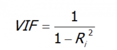
Reducing multicollinearity using the Pearson correlation is quite a manual method. We can look at a more automated method, called the Variance Inflation Factor value (VIF).
VIF is a number that determines whether a variable has multicollinearity or not. That number also represents how much a variable is inflated because of the linear dependence with other variables.
It is calculated by taking a variable and regressing it against every other variables.
Assuming you have a list of features — x₁, x₂, x₃, and x₄. You first take the first feature, x₁, and regress it against the other features (in other words, treat x₁ as the target variable and use the other features to predict x₁:
x₁ ~ x₂ + x₃ + x₄
And you find the R-squared for, x₁ being the target. If R-squared is large –> x₁ is highly correlated with the three features - x2, x3, x4. If R-squared is small –> x₁ is not correlated with the free features - x₂, x₃, x₄.
Source: https://towardsdatascience.com/statistics-in-python-collinearity-and-multicollinearity-4cc4dcd82b3f
- A value of 1 indicates there is no correlation between a given explanatory variable and any other explanatory variables in the model.
- A value between 1 and 5 indicates moderate correlation between a given explanatory variable and other explanatory variables in the model, but this is often not severe enough to require attention.
- A value greater than 5 indicates potentially severe correlation between a given explanatory variable and other explanatory variables in the model. In this case, the coefficient estimates and p-values in the regression output are likely unreliable.
source: https://www.statology.org/how-to-calculate-vif-in-python/
To calculate VIF, we can import variance_inflation_factor and add_constant from the statsmodels library.
from statsmodels.stats.outliers_influence import variance_inflation_factor
from statsmodels.tools.tools import add_constant
Syntax : statsmodels.stats.outliers_influence.variance_inflation_factor(exog, exog_idx)
This function takes two parameters :
- exog : an array containing features/predictors on which linear regression is performed.
- exog_idx : index of the additional feature whose influence on the other features is to be measured.
First, we will drop the price, cut, color and clarity columns from the diamonds dataset as they are either categorical or the target variable.
features = diamonds.drop(columns = ['price', 'cut', 'color', 'clarity'])
features
carat depth table x y z
0 0.23 61.5 55.0 3.95 3.98 2.43
1 0.21 59.8 61.0 3.89 3.84 2.31
2 0.23 56.9 65.0 4.05 4.07 2.31
3 0.29 62.4 58.0 4.20 4.23 2.63
4 0.31 63.3 58.0 4.34 4.35 2.75
... ... ... ... ... ... ...
53935 0.72 60.8 57.0 5.75 5.76 3.50
53936 0.72 63.1 55.0 5.69 5.75 3.61
53937 0.70 62.8 60.0 5.66 5.68 3.56
53938 0.86 61.0 58.0 6.15 6.12 3.74
53939 0.75 62.2 55.0 5.83 5.87 3.64
[53940 rows x 6 columns]Then, we need to create a variable which is a constant and will be based on the predictors.
X = add_constant(features)Then, we will create a series based on this function, using variance_inflation_factor.
The function explained:
X.values: the values of our predictors, which we defined in the cell above.
i: this is each of the columns - it will be the target.
the for loop: it will iterate over all of the columns/features in X, and for each feature, it will calculate the VIF and create a list of these VIF values.
It is then sorted in descending order, so the features with the highest VIFs are at the top.
pd.Series([variance_inflation_factor(X.values, i)
               for i in range(X.shape[1])],
              index=X.columns).sort_values(ascending = False)
const 4821.696350
x 56.187704
z 23.530049
carat 21.602712
y 20.454295
depth 1.496590
table 1.143225
dtype: float64The constant can be ignored, as this just represents the intercept, but what could be said about the multicollinearity in the other variables? Is there no, moderate or severe multicollinearity?
Note: If multicollinearity is extreme, there will be so much overlap that there will be no need to use both predictors as they will contain essentially the same information.
The creator of this function advised that we remove predictors 1 by 1 from the list, which will allow us to see that when remvoving one predictor, the VIF values for the remaining predictors will change.
Let’s experiment with this below.
We already have removed the categorical and target variables, so we need to remove x from the features as well.
features.drop(columns = ['x'], inplace = True)
features
carat depth table y z
0 0.23 61.5 55.0 3.98 2.43
1 0.21 59.8 61.0 3.84 2.31
2 0.23 56.9 65.0 4.07 2.31
3 0.29 62.4 58.0 4.23 2.63
4 0.31 63.3 58.0 4.35 2.75
... ... ... ... ... ...
53935 0.72 60.8 57.0 5.76 3.50
53936 0.72 63.1 55.0 5.75 3.61
53937 0.70 62.8 60.0 5.68 3.56
53938 0.86 61.0 58.0 6.12 3.74
53939 0.75 62.2 55.0 5.87 3.64
[53940 rows x 5 columns]# the same code as above
X = add_constant(features)
pd.Series([variance_inflation_factor(X.values, i)
for i in range(X.shape[1])],
index=X.columns).sort_values(ascending = False)const 4068.418740
z 16.496237
y 15.662011
carat 14.300114
depth 1.301740
table 1.141596
dtype: float64What do you notice about the VIF values now?
features.drop(columns = ['z'], inplace = True)
X = add_constant(features)
pd.Series([variance_inflation_factor(X.values, i)
               for i in range(X.shape[1])],
              index=X.columns).sort_values(ascending = False)
const 3948.646039
carat 11.053741
y 10.986312
depth 1.141634
table 1.141550
dtype: float64features.drop(columns = ['carat'], inplace = True)
X = add_constant(features)
pd.Series([variance_inflation_factor(X.values, i)
for i in range(X.shape[1])],
index=X.columns).sort_values(ascending = False)const 3481.317490
table 1.133999
depth 1.096650
y 1.035683
dtype: float64Now all the values are between 1 and 5 so we can say thay we are happy with this. This means we will be using the columns table, depth and y.
X = features
y = diamonds['price']
X_train, X_test, y_train, y_test = train_test_split(X,
y,
test_size=0.3,
random_state = 2021
)
model2 = LinearRegression()
model2 = model2.fit(X_train, y_train)
y_predicted = model2.predict(X_test)
print('Train r2 =', model2.score(X_train, y_train))Train r2 = 0.7728852592671327print('Test r2 =', model2.score(X_test, y_test))Test r2 = 0.6914461720671704print('MAE =', mean_absolute_error(y_test, y_predicted))MAE = 1342.0384963618928print('RMSE =', mean_squared_error(y_test, y_predicted))RMSE = 4803998.428937084From this, we can see that we have smaller R squared values, as well as smaller MAE and RMSE. Let’s validate the model next:
model_val = LinearRegression()
scores = cross_val_score(model_val, X, y, cv=5, scoring = 'r2')

print(scores)
[ -1.97709815 0.57401941 0.52351579 -17.37146196 -7.08240436]print()print('Mean:', scores.mean())Mean: -5.066685854977694print()print('Std:', scores.std())Std: 6.754022483818166
# from the previous model (Pearsons):
# Mean: -1.5254398849083137
# Std: 2.726476201388095
Let’s compare the mean and the standard deviation from our current model with the previous model. What can we say about it?
The one with the highest standard deviation is worse, as it shows that the model is less stable. In other words - the model’s predictions are more spread out around the mean value. So, it seems like the VIF method hasn’t worked very well on our data so we would stick with the Pearson method.
When you’re deciding on a model, it’s crucial to consider both the initial evaluation metrics (like R², MAE, RMSE) and the cross-validation results. Cross-validation provides a more comprehensive view of how your model might perform on unseen data. In this case, despite the VIF model initially appearing more promising, the cross-validation results favour the Pearson’s model
2.17 Linearity
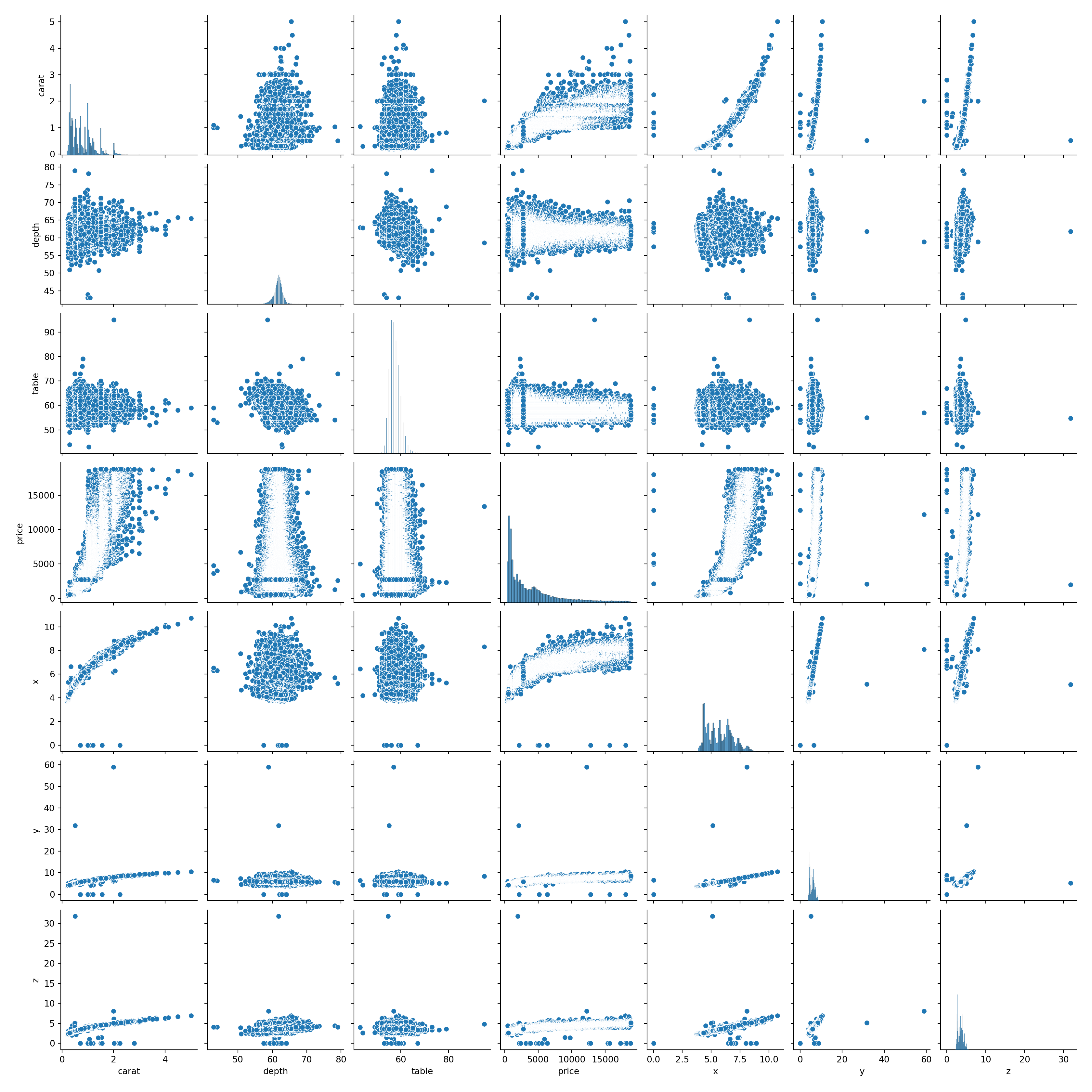
Another important assumption is the linearity - i.e, that the relationship between X and the mean of Y is linear. For example, we ae assuming that the price of the diamonds is linear with any of the predictors.
To check this, we can build a pairplot in seaborn. This will allow us to look at the relationships between each of the variables.
What do you notice about the relationships between the variables? Are all of the correlations linear?
# create pairplot
sns.pairplot(diamonds)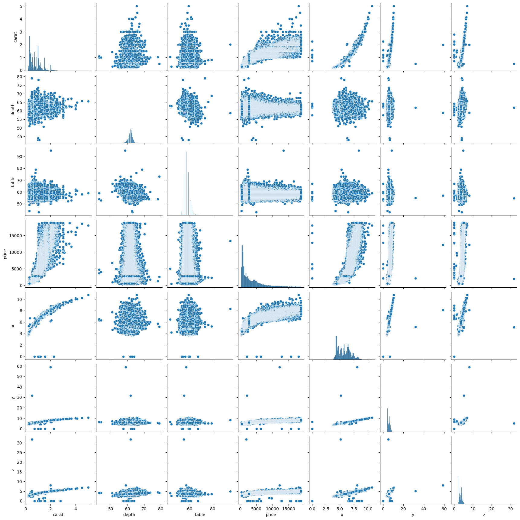
2.18 Mean of Residuals
Residuals are the differences between the true values and the predicted values. In an ideal world, the mean of residuals should be zero.
For more information on residuals, this website is helpful.
# create a model
X = diamonds[['carat', 'table', 'depth']]
y = diamonds['price']

X_train, X_test, y_train, y_test = train_test_split(X, y, test_size=0.3, random_state = 2021)

model = LinearRegression()
model = model.fit(X_train, y_train)
# create a variable called estimated price
estimated_price = model.predict(X_train)# create a table with the price and estimated price
table = pd.DataFrame(y_train)
table['estimated_price'] = estimated_price
table price estimated_price
22196 10236 10489.040349
30985 746 549.129323
35881 918 511.860894
47710 1884 2394.691959
39176 1063 591.230184
... ... ...
2669 3238 3456.702746
17536 7056 8934.464293
6201 3998 5412.108397
27989 658 83.479168
25716 14624 10216.263340
[37758 rows x 2 columns]# create a column for errors - this will be the price minus the estimated price
table['errors'] = table['price'] - table['estimated_price']
table price estimated_price errors
22196 10236 10489.040349 -253.040349
30985 746 549.129323 196.870677
35881 918 511.860894 406.139106
47710 1884 2394.691959 -510.691959
39176 1063 591.230184 471.769816
... ... ... ...
2669 3238 3456.702746 -218.702746
17536 7056 8934.464293 -1878.464293
6201 3998 5412.108397 -1414.108397
27989 658 83.479168 574.520832
25716 14624 10216.263340 4407.736660
[37758 rows x 3 columns]Note here, we don’t take the absolute value of the errors, only the actual value. We want our mean of residuals to be as close to zero as possible, regardless of whether this is is the positive or negative direction.
# calculate the mean of the errors column

table['errors'].mean()-1.7728378105431303e-13# 0.0000000000006790739613428251The mean is very close to zero, which is good. It means our errors are balanced.
2.19 Homoscedasticity
(pronounced “homo-sked-asticity”) - means “same variance”
Homoscedasticity is an important assumption in linear regression for several reasons. It helps to ensure the validity, reliability, and interpretability of the results.
Homoscedasticity means that the residuals have equal or almost equal variance across the regression line. By plotting the error terms with estimated terms we can check that there should not be any pattern in the error terms.
Below, on the left we have an example of when the residuals are homoscedastic. They have an equal variance and are each about the same distance away from the regression line.
On the right, they are distributed at different variances and are not constant - they are at widely differing stances from the regression line. This is called heteroscedasticity. Notice the heteroscedastic model resembles a funnel - this is something we want to avoid.
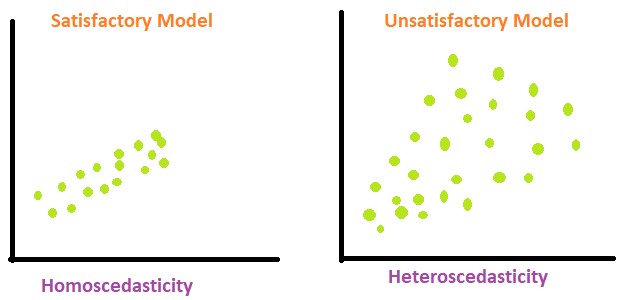
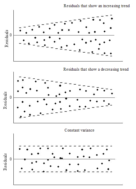
We can create a graph to visualise whether the data is homoscedastic or heteroscedastic, but actually it’s very difficult to tell just by looking at it. And where would we draw the line at how homoscedastic it is?
# create a scatterplot to check for homoscedasticity
plt.figure(figsize = (14, 8))

plt.scatter(table['errors'], table['estimated_price'])
plt.xlabel('estimated values')
plt.ylabel('Residuals')
plt.title('Residuals vs fitted values plot for homoscedasticity check')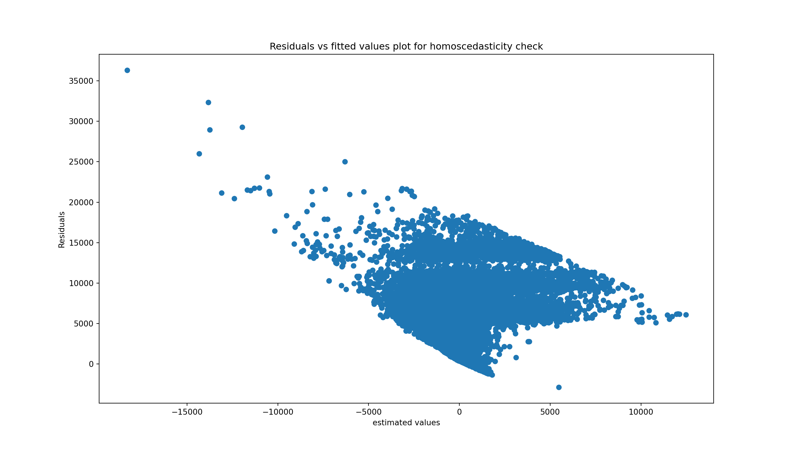
Instead we can use a statistical test, which will check for us whether our errors are homoscedastic or heteroscedastic. There are a lot of pre-built tests in the machine packages we are using so we don’t need to build our own, we can just use the pre-existing ones and interpret them.
Several tests exist for equal variance, with different alternative hypotheses. Let’s go with Goldfeld Quandt test as an example.
Null Hypothesis: Error terms are homoscedastic.
Alternative Hypothesis: Error terms are heteroscedastic.
# Conducting the Goldfeld Quandt test
name = ['F statistic', 'p-value']
test = sms.het_goldfeldquandt(table['errors'], X_train)
lzip(name, test)
[('F statistic', 0.979422546531555), ('p-value', 0.9233947030080647)]To interpret these results:
The F-statistic is the ratio of variances to the residuals. In a homoscedastic situation (where variances are equal), we expect this ratio to be approximately 1. Our F statistic you have here, 0.9794, is very close to 1, suggesting that the variances in the two subsets of the data are quite similar.
The p-value tells us the probability of observing the data if the null hypothesis of the test (in this case, that the residuals are homoscedastic) is true. A high p-value suggests that there is not enough evidence to reject the null hypothesis. In our case, the p-value is 0.9234, which is very high!
Since the p-value is more than 0.05 in Goldfeld Quandt Test, we can’t reject it’s null hypothesis that error terms are homoscedastic. So, we can conclude that the errors are homoscedastic.
Note: if the errors are heteroscedastic and don’t have an equal variance, then this means we probably have some large outliers and this would need to be investigated and see what is wrong with the data.
2.20 Normality of errors
We can also check for the normality of the errors - in a linear regression model, we would assume that the error terms follow a normal distribution. The plot below demonstrates this.
sns.distplot(table['errors'],kde=True)
plt.title('Normality of error')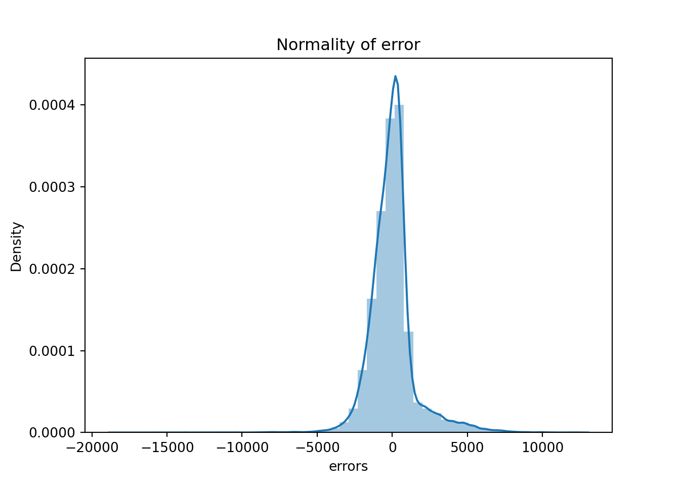
The residual terms are pretty much normal. However, we have long tails which means we have some big outliers in the errors which might be harming the model. Let’s investigate them.
# viewing the errors in the table
table['errors']
22196 -253.040349
30985 196.870677
35881 406.139106
47710 -510.691959
39176 471.769816
...
2669 -218.702746
17536 -1878.464293
6201 -1414.108397
27989 574.520832
25716 4407.736660
Name: errors, Length: 37758, dtype: float64Like with homoscedasticity, we can create a plot that will show us roughly what the errors look like but we need to do a statistical test to get some proof. We will use the Shapiro-Wilk test as it is the most powerful test for the normality.
from scipy.stats import shapiro
stat, p_value = shapiro(table['errors'])
C:\Users\GEORGI~1\AppData\Local\Programs\Python\PYTHON~1\Lib\site-packages\scipy\stats\_axis_nan_policy.py:531: UserWarning: scipy.stats.shapiro: For N > 5000, computed p-value may not be accurate. Current N is 37758.
res = hypotest_fun_out(*samples, **kwds)print(f"stat = {stat}, p_value = {p_value}")stat = 0.8792877183371967, p_value = 2.5672239334406655e-95if p_value > 0.05:
print('Probably Normal Distribution')
else:
print('Probably not Normal Distribution')Probably not Normal Distribution2.21 How to improve the model
Next we can look at improving the model, using feature engineering, where we will create some new predictors for the model. For example, in the diamonds dataset there were some columns we didn’t use. So far we have just used the numerical columns: depth, table, price, x, y and z. But what about the categorical columns - cut, colour, clarity? These variables will also influence the price in some way.
We need to convert these columns to numbers for our model to understand, as it doesn’t understand categories.
2.21.1 Categorical features
diamonds.head() carat cut color clarity depth table price x y z
0 0.23 Ideal E SI2 61.5 55.0 326 3.95 3.98 2.43
1 0.21 Premium E SI1 59.8 61.0 326 3.89 3.84 2.31
2 0.23 Good E VS1 56.9 65.0 327 4.05 4.07 2.31
3 0.29 Premium I VS2 62.4 58.0 334 4.20 4.23 2.63
4 0.31 Good J SI2 63.3 58.0 335 4.34 4.35 2.75Let’s look at the categories we have for the cut column.
diamonds['cut'].value_counts()cut
Ideal 21551
Premium 13791
Very Good 12082
Good 4906
Fair 1610
Name: count, dtype: int64How could we convert these to numerical values? We could create some sort of rating, where “Ideal” is 0 and “Fair” is 4, but this wouldn’t work for a column where we don’t know the context of the categories, for example the color column.
diamonds['clarity'].value_counts()clarity
SI1 13065
VS2 12258
SI2 9194
VS1 8171
VVS2 5066
VVS1 3655
IF 1790
I1 741
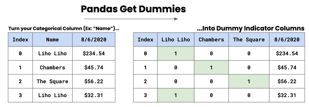
Name: count, dtype: int64A method we can use in this case is the use of dummy columns, and we can convert these categories into separate columns. In the image below, we have some names and dummy indicator columns are created based on these names. A 1 will be present where the name is present, and a 0 will be present when the name is absent.
2.21.1.1 Dummy columns
To implement this, we use pd.get_dummies().
pd.get_dummies(diamonds['cut']) Ideal Premium Very Good Good Fair
0 True False False False False
1 False True False False False
2 False False False True False
3 False True False False False
4 False False False True False
... ... ... ... ... ...
53935 True False False False False
53936 False False False True False
53937 False False True False False
53938 False True False False False
53939 True False False False False
[53940 rows x 5 columns]The default output is boolean, if we want the output to be a 0 or a 1 we need to specify dtype = int.
pd.get_dummies(diamonds['cut'], dtype = int) Ideal Premium Very Good Good Fair
0 1 0 0 0 0
1 0 1 0 0 0
2 0 0 0 1 0
3 0 1 0 0 0
4 0 0 0 1 0
... ... ... ... ... ...
53935 1 0 0 0 0
53936 0 0 0 1 0
53937 0 0 1 0 0
53938 0 1 0 0 0
53939 1 0 0 0 0
[53940 rows x 5 columns]We have created a problem for ourselves though, in the sense that in the model there will be a perfect correlation (multicollinearity). The model will know that each of these categories compensate each other; for example, if a diamond isn’t premium, very good, good or fair it will be ideal - they are dependent of each other.
To try and combat this we can introduce drop_first = True which will drop the first column from the data frame. For example, the Ideal column will be dropped and this means the model won’t have the full picture of the data as it breaks the relationship between the variables.
dummies = pd.get_dummies(diamonds[['cut', 'color', 'clarity']], drop_first = True, dtype = int)
dummies
cut_Premium cut_Very Good ... clarity_SI2 clarity_I1
0 0 0 ... 1 0
1 1 0 ... 0 0
2 0 0 ... 0 0
3 1 0 ... 0 0
4 0 0 ... 1 0
... ... ... ... ... ...
53935 0 0 ... 0 0
53936 0 0 ... 0 0
53937 0 1 ... 0 0
53938 1 0 ... 1 0
53939 0 0 ... 1 0
[53940 rows x 17 columns]We now have 17 columns, and notice that we are missing one column from each categorical variable: Ideal from cut, D from color, and IF from clarity. Now we need to link or concatenate this dataframe with the original dataframe. We will use axis=1 to concatenate the dataframe to the column rather than to the rows.
diamonds_dummies = pd.concat([diamonds, dummies], axis = 1)
diamonds_dummies
carat cut color ... clarity_SI1 clarity_SI2 clarity_I1
0 0.23 Ideal E ... 0 1 0
1 0.21 Premium E ... 1 0 0
2 0.23 Good E ... 0 0 0
3 0.29 Premium I ... 0 0 0
4 0.31 Good J ... 0 1 0
... ... ... ... ... ... ... ...
53935 0.72 Ideal D ... 1 0 0
53936 0.72 Good D ... 1 0 0
53937 0.70 Very Good D ... 1 0 0
53938 0.86 Premium H ... 0 1 0
53939 0.75 Ideal D ... 0 1 0
[53940 rows x 27 columns]diamonds_dummies = pd.concat([diamonds, dummies], axis = 1) diamonds_dummies
# drop necessary columns
X = diamonds_dummies.drop(columns = ['cut', 'color', 'clarity', 'price', 'x', 'y', 'z'])

# rerun the model
X_train, X_test, y_train, y_test = train_test_split(X, y, test_size=0.3, random_state = 2021)

model = LinearRegression()
model = model.fit(X_train, y_train)
X_train.head() carat depth table ... clarity_SI1 clarity_SI2 clarity_I1
22196 1.61 62.4 55.0 ... 1 0 0
30985 0.37 61.5 58.0 ... 0 0 0
35881 0.32 61.3 55.0 ... 0 0 0
47710 0.57 60.5 57.0 ... 0 0 0
39176 0.35 61.6 56.0 ... 0 0 0
[5 rows x 20 columns]Let’s rerun the R squared scores to see if we get a better score than what we had before. Before we had roughly 85% accuracy.
print('Train r2 =', model.score(X_train, y_train))Train r2 = 0.9160384223027856print('Test r2 =', model.score(X_test, y_test))Test r2 = 0.9159937057396672We still need to validate the model and see if it is stable.
model = LinearRegression()
scores = cross_val_score(model, X, y, cv=5, scoring = 'r2')

print(scores)
[ 0.19904545 0.69344633 0.82331853 -13.50067632 -1.2122227 ]print()print('Mean:', scores.mean())Mean: -2.599417741022702print()print('Std:', scores.std())Std: 5.4982037460803355We can see that the model is quite unstable as we have varying scores across the 5 folds. Maybe we can look at removing outliers to see if this will improve the model.
2.22 Outliers
Another thing we might want to do is check the outliers. Below, we’ll create some scatterplots to view the relationships between carat and price, depth and price, and table and price. This will help us view the outliers in scatterplot form. When we remove the outloers, the model will be able to better estimate the line of best fit for the data points.
# creating scatter plots
fig, axes = plt.subplots(1, 3, figsize = (15,5), sharey = True)
features = ['carat', 'depth', 'table']

for m, ax in enumerate(axes):
    sns.scatterplot(data = diamonds, x = features[m], y = 'price', ax = ax, alpha = 0.5)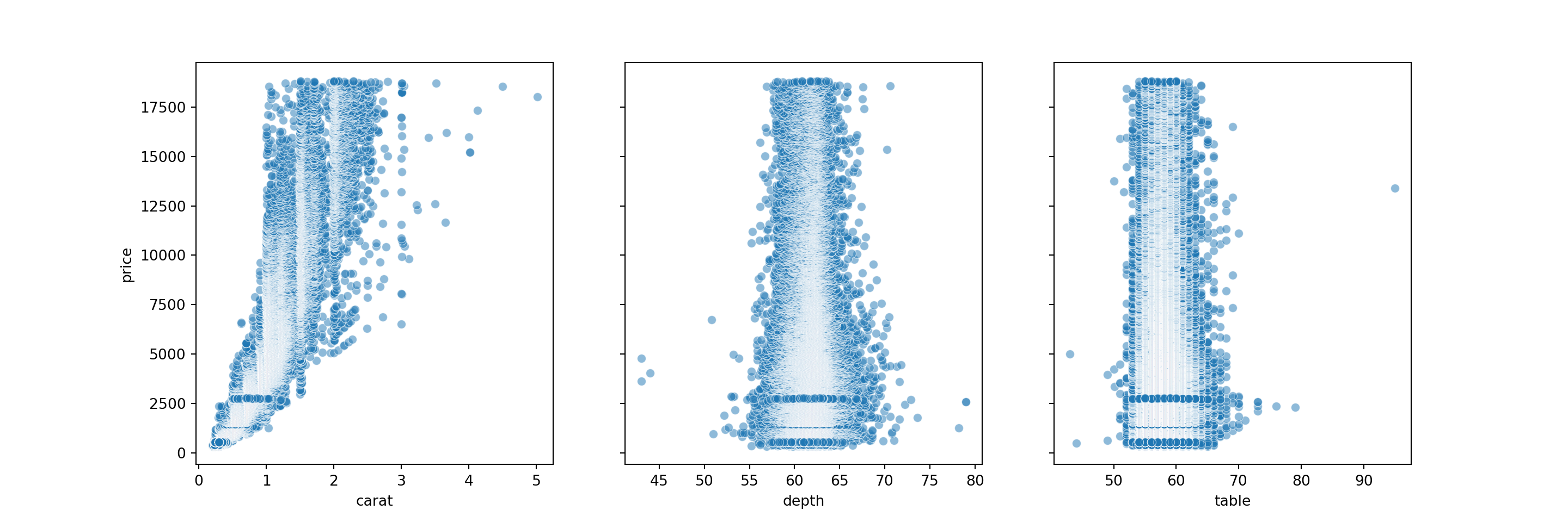
# get percentiles
q1, q3= np.percentile(diamonds['carat'],[25,75])

# the IQR value
iqr = q3 - q1

# upper bound
lower_bound = q1 - (1.5 * iqr)
# lower bound
upper_bound = q3 + (1.5 * iqr)
# how many datapoints are above the upper bound?
np.sum(diamonds['carat'] > upper_bound) 1889# how many datapoints are below the lower bound?
np.sum(diamonds['carat'] < lower_bound) 0# filter the table to exclude the outliers
diamonds_without_outliers = diamonds[(diamonds['carat'] < upper_bound) & (diamonds['carat'] > lower_bound)]
diamonds_without_outliers carat cut color clarity depth table price x y z
0 0.23 Ideal E SI2 61.5 55.0 326 3.95 3.98 2.43
1 0.21 Premium E SI1 59.8 61.0 326 3.89 3.84 2.31
2 0.23 Good E VS1 56.9 65.0 327 4.05 4.07 2.31
3 0.29 Premium I VS2 62.4 58.0 334 4.20 4.23 2.63
4 0.31 Good J SI2 63.3 58.0 335 4.34 4.35 2.75
... ... ... ... ... ... ... ... ... ... ...
53935 0.72 Ideal D SI1 60.8 57.0 2757 5.75 5.76 3.50
53936 0.72 Good D SI1 63.1 55.0 2757 5.69 5.75 3.61
53937 0.70 Very Good D SI1 62.8 60.0 2757 5.66 5.68 3.56
53938 0.86 Premium H SI2 61.0 58.0 2757 6.15 6.12 3.74
53939 0.75 Ideal D SI2 62.2 55.0 2757 5.83 5.87 3.64
[51786 rows x 10 columns]This leaves us with a dataframe of 51786 rows. Now, we will use dummy columns with the outliers excluded - this is the same code as above but with our new diamonds_without_outliers dataframe.
dummies = pd.get_dummies(diamonds_without_outliers[['cut','color', 'clarity']], drop_first = True)
diamonds_dummies_outl = pd.concat([diamonds_without_outliers, dummies], axis = 1)
diamonds_dummies_outl.head()
carat cut color ... clarity_SI1 clarity_SI2 clarity_I1
0 0.23 Ideal E ... False True False
1 0.21 Premium E ... True False False
2 0.23 Good E ... False False False
3 0.29 Premium I ... False False False
4 0.31 Good J ... False True False
[5 rows x 27 columns]# building another model with the new dataframe
X = diamonds_dummies_outl.drop(columns = ['cut','color', 'clarity', 'price', 'x', 'z', 'y'])
y = diamonds_dummies_outl['price']
X_train, X_test, y_train, y_test = train_test_split(X, y, test_size=0.3, random_state = 2021)
model = LinearRegression()
model = model.fit(X_train, y_train)
# print the scores
print('Train r2 =', model.score(X_train, y_train))Train r2 = 0.9008183055496429print('Test r2 =', model.score(X_test, y_test))Test r2 = 0.9019915047333236We have 90% for both the train and test tests, which is a great score. But is the model stable?
# testing stability of the model
scores = cross_val_score(model, X, y, cv=5, scoring = 'r2')
print(scores)
[ 0.21676685 0.71043897 0.81295638 -11.30692013 -1.00928142]print()print('Mean:', scores.mean())Mean: -2.1152078714849094print()print('Std:', scores.std())Std: 4.641275248263355It’s not very stable as we have a negative mean and a large standard deviation. To try and improve this, we could remove outliers from other columns.
2.23 Ridge and Lasso
So far, we have covered linear regression which is seen as quite a common and simple model. In this notebook we will explore the ridge and lasso regression techniques
2.23.1 Linear Regression - Baseline
Below we have the code for our baseline linear regression model for the diamonds dataset.
diamonds = sns.load_dataset('diamonds')
diamonds.head()
carat cut color clarity depth table price x y z
0 0.23 Ideal E SI2 61.5 55.0 326 3.95 3.98 2.43
1 0.21 Premium E SI1 59.8 61.0 326 3.89 3.84 2.31
2 0.23 Good E VS1 56.9 65.0 327 4.05 4.07 2.31
3 0.29 Premium I VS2 62.4 58.0 334 4.20 4.23 2.63
4 0.31 Good J SI2 63.3 58.0 335 4.34 4.35 2.75X = diamonds[['carat', 'depth', 'table', 'x', 'y', 'z']]
y = diamonds['price']
X_train, X_test, y_train, y_test = train_test_split(X, y, test_size=0.3, random_state = 2021)
model = LinearRegression()
model = model.fit(X_train, y_train)
print('Train r2 =', model.score(X_train, y_train))Train r2 = 0.858308814142413print('Test r2 =', model.score(X_test, y_test))Test r2 = 0.8606236418703779estimated_price = model.predict(X_train)
ev_table = pd.DataFrame(y_train)
ev_table['estimated_price'] = estimated_price
ev_table price estimated_price
22196 10236 10596.367652
30985 746 769.355073
35881 918 765.037879
47710 1884 2319.900298
39176 1063 740.843669
... ... ...
2669 3238 3262.979125
17536 7056 8986.378882
6201 3998 5164.966924
27989 658 411.672311
25716 14624 10319.481542
[37758 rows x 2 columns]2.23.2 How does the Linear Regression algorithm find the best fit line?
We use the line of code model = LinearRegression() to run our linear regression model. But what’s happening under the hood, and how does it find the regression line that best fits the data, where it has the lowest residuals?
We already found out that in the linear function, we have two constants - the slope (m) and the y-intercept(b).
We will do an experiment, where we are just running the model on carat (the predictor) and price (the target).
diamond_exp = diamonds[['carat', 'price']]
diamond_exp
carat price
0 0.23 326
1 0.21 326
2 0.23 327
3 0.29 334
4 0.31 335
... ... ...
53935 0.72 2757
53936 0.72 2757
53937 0.70 2757
53938 0.86 2757
53939 0.75 2757
[53940 rows x 2 columns]If we build a scatterplot to visualise the relationship between carat and price. Our model will have a straight line somewhere to estimate these data points.
plt.scatter(diamonds['carat'], diamonds['price'], alpha = 0.5)
Using the y=mx+c formula, our linear function will look something like:
price = slope * diamonds[‘carat’] + intercept
# m = None
# c = None

# price = m * diamonds['carat'] + c
What would happen if we set both m and c as 1?
m = 1
c = 1

estimated_price_1 = c + m * diamonds['carat']
estimated_price_1
0 1.23
1 1.21
2 1.23
3 1.29
4 1.31
...
53935 1.72
53936 1.72
53937 1.70
53938 1.86
53939 1.75
Name: carat, Length: 53940, dtype: float64diamond_exp['estimated_price_1'] = estimated_price_1<string>:1: SettingWithCopyWarning:
A value is trying to be set on a copy of a slice from a DataFrame.
Try using .loc[row_indexer,col_indexer] = value instead
See the caveats in the documentation: https://pandas.pydata.org/pandas-docs/stable/user_guide/indexing.html#returning-a-view-versus-a-copydiamond_exp carat price estimated_price_1
0 0.23 326 1.23
1 0.21 326 1.21
2 0.23 327 1.23
3 0.29 334 1.29
4 0.31 335 1.31
... ... ... ...
53935 0.72 2757 1.72
53936 0.72 2757 1.72
53937 0.70 2757 1.70
53938 0.86 2757 1.86
53939 0.75 2757 1.75
[53940 rows x 3 columns]Let’s view the regression line on the scatterplot. Is it a good fit to the model? Why?
plt.scatter(diamond_exp['carat'], diamond_exp['price'], alpha = 0.5)
plt.plot(diamond_exp['carat'], diamond_exp['estimated_price_1'], 'r-')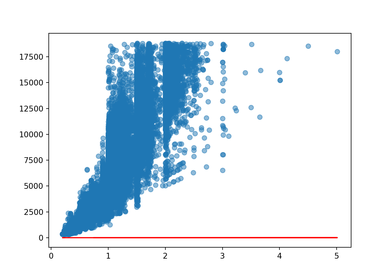
What if we changed the values of m and c?
m = 100
c = 20

estimated_price_2 = c + m * diamonds['carat']
estimated_price_2
0 43.0
1 41.0
2 43.0
3 49.0
4 51.0
...
53935 92.0
53936 92.0
53937 90.0
53938 106.0
53939 95.0
Name: carat, Length: 53940, dtype: float64diamond_exp['estimated_price_2'] = estimated_price_2<string>:1: SettingWithCopyWarning:
A value is trying to be set on a copy of a slice from a DataFrame.
Try using .loc[row_indexer,col_indexer] = value instead
See the caveats in the documentation: https://pandas.pydata.org/pandas-docs/stable/user_guide/indexing.html#returning-a-view-versus-a-copydiamond_exp carat price estimated_price_1 estimated_price_2
0 0.23 326 1.23 43.0
1 0.21 326 1.21 41.0
2 0.23 327 1.23 43.0
3 0.29 334 1.29 49.0
4 0.31 335 1.31 51.0
... ... ... ... ...
53935 0.72 2757 1.72 92.0
53936 0.72 2757 1.72 92.0
53937 0.70 2757 1.70 90.0
53938 0.86 2757 1.86 106.0
53939 0.75 2757 1.75 95.0
[53940 rows x 4 columns]plt.scatter(diamond_exp['carat'], diamond_exp['price'], alpha = 0.5)
plt.plot(diamond_exp['carat'], diamond_exp['estimated_price_1'], 'r-')
plt.plot(diamond_exp['carat'], diamond_exp['estimated_price_2'], 'g-')
It fits better than the red line but is still very far off being a good fit for the model. We need to change the slope as it is nowhere near steep enough.
m = 1000
c = 20

estimated_price_3 = c + m * diamonds['carat']
estimated_price_3
0 250.0
1 230.0
2 250.0
3 310.0
4 330.0
...
53935 740.0
53936 740.0
53937 720.0
53938 880.0
53939 770.0
Name: carat, Length: 53940, dtype: float64diamond_exp['estimated_price_3'] = estimated_price_3<string>:1: SettingWithCopyWarning:
A value is trying to be set on a copy of a slice from a DataFrame.
Try using .loc[row_indexer,col_indexer] = value instead
See the caveats in the documentation: https://pandas.pydata.org/pandas-docs/stable/user_guide/indexing.html#returning-a-view-versus-a-copydiamond_exp carat price estimated_price_1 estimated_price_2 estimated_price_3
0 0.23 326 1.23 43.0 250.0
1 0.21 326 1.21 41.0 230.0
2 0.23 327 1.23 43.0 250.0
3 0.29 334 1.29 49.0 310.0
4 0.31 335 1.31 51.0 330.0
... ... ... ... ... ...
53935 0.72 2757 1.72 92.0 740.0
53936 0.72 2757 1.72 92.0 740.0
53937 0.70 2757 1.70 90.0 720.0
53938 0.86 2757 1.86 106.0 880.0
53939 0.75 2757 1.75 95.0 770.0
[53940 rows x 5 columns]plt.scatter(diamond_exp['carat'], diamond_exp['price'], alpha = 0.5)
plt.plot(diamond_exp['carat'], diamond_exp['estimated_price_1'], 'r-')
plt.plot(diamond_exp['carat'], diamond_exp['estimated_price_2'], 'g-')
plt.plot(diamond_exp['carat'], diamond_exp['estimated_price_3'], 'y-')
Again, it’s better than the previous ones but still not a good fit to the data. So our question is, what are the best values for the intercept and slope?
We can see below the mean squared errors for these 3 regression lines are very large. The first one has the largest MSE and the third one has the smallest MSE, although it is still an absolutely huge error.
# mean squared error
print(mean_squared_error(diamond_exp['price'], diamond_exp['estimated_price_1']))31364624.132536795print(mean_squared_error(diamond_exp['price'], diamond_exp['estimated_price_2']))30260967.63403782print(mean_squared_error(diamond_exp['price'], diamond_exp['estimated_price_3']))22356903.404949944Thankfully we don’t have to do this manually - this is what our linear regression model is doing under the hood, trying many different slopes and intercepts to see which one fits the data best.
2.23.3 Loss Function
The loss is the error in our predicted value of m and c. The goal is to minimize this error to obtain the most accurate value of m and c.
2.23.4 Gradient Descent
Gradient Descent is an algorithm that can find the minimum of a function by optimising it through multiple iterations.
2.23.5 Regularization
Linear Regression is the most basic method from the regression family, where the model is not penalised for its choice of weights. However, this means that during the training process, if the model considers a particular feature important, the model will place a large weight on the feature. Sometimes this can cause overfitting in smaller sets, especially if there are a lot of predictors.
Lasso, Ridge and ElasticNet are methods from the Linear Regression family that may penalize the model for its weights, specifically the predictors that aren’t good for the model. It will try to reduce the coefficient (m) for these predictors that aren’t good for the model. As a result, they reduce model complexity and prevent over-fitting.
Why not just remove the predictors from the model if they are harming it? They might still contain valuable information - in some cases, every predictor is important for understanding the data so removing them should be avoided if possible.
2.23.6 Ridge
In Ridge regression, the cost function is altered by adding a penalty equivalent to the square of the magnitude of the coefficients. The penalty term (lambda) regularizes the coefficients such that if the coefficients take large values, the optimization function is penalised. The higher the lambda, the bigger the penalty term; therefore, the magnitude of coefficients is reduced. So, the Ridge regression shrinks the coefficients, and it helps to reduce the model complexity and multicollinearity.
The below shows the formula for the Ridge Regression Cost Function.
The red box contains the cost function formula, and the blue box contains the Ridge penalty term - a weight which is squared and multiplied by lambda, \(\lambda\). This lambda is set up in the model by us and if we increase \(\lambda\), it means that our model will be more penalised - if we decrease \(\lambda\) the model will be less penalised.
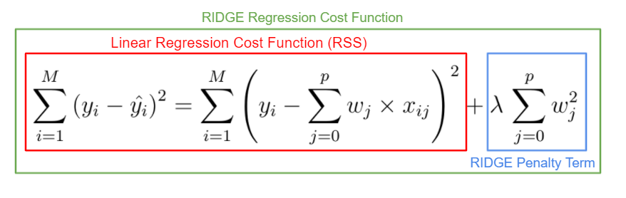
Note: when using Ridge and Lasso, in order to get a more balanced model we may end up with a worse R squared score than with a model that has multicollinearity in it. If this is the case, you’ll need to decide what is the most important outcome for this model. Do you want a model with the highest accuracy that can give good predictions or do you need to understand which predictor is the most important?
from sklearn.linear_model import RidgeIn scikit-learn, lambda is specified as alpha, and by default it is eqaul to 1. Larger values specify stronger regularization. Below, alpha is set as 5 so this will have a very harsh impact on the model.
ridge_regr_model = Ridge(alpha = 5)

ridge_regr_model.fit(X_train, y_train)Ridge(alpha=5)In a Jupyter environment, please rerun this cell to show the HTML representation or trust the notebook.
On GitHub, the HTML representation is unable to render, please try loading this page with nbviewer.org.
Ridge(alpha=5)
Then, the steps below are very similar to what we have encountered before, where we can get the coefficient and the model scores.
# ['carat', 'depth', 'table', 'x', 'y', 'z']
# LR coef: [10554.97807623,  -214.50311236,  -105.1861397 , -1489.91890779,
#          280.71632526,    79.14284322]


ridge_regr_model.coef_
array([10422.63955994, -211.14171713, -104.99669005, -1422.11699744,
276.95479808, 63.72089772])model.coef_array([10554.97807623, -214.50311236, -105.1861397 , -1489.91890779,
280.71632526, 79.14284322])All of the coefficients have been reduced.
When looking at the the scores, the regularisation might not always perform the same, sometimes it might perform better, sometimes it might perform worse. If we get the same R squared score, it might be that the Ridge regression isn’t providing anything extra and has no additional predictive power over the baseline model.
# baseline model
# Train r2 = 0.858308814142413
# Test r2 = 0.8606236418703779
ridge_regr_model.score(X_test, y_test)0.8605809848066113ridge_regr_model.score(X_train, y_train)0.85829662554615162.23.7 Lasso
Lasso is a modified Linear Regression method where the model is penalised for the sum of absolute values of the weights. The absolute value of weight tends to be reduced. Some of them may be reduced to zeros.
So, the only difference between Ridge and Lasso is that magnitudes are taken into account instead of taking the square of the coefficients.
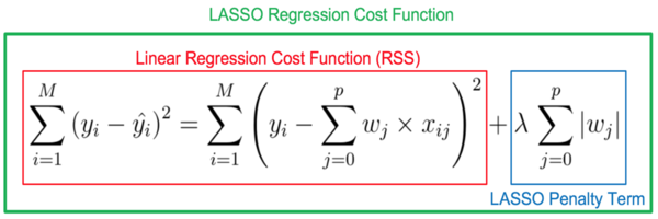
from sklearn.linear_model import Lasso
lasso = Lasso(alpha = 5)
lasso.fit(X_train, y_train)Lasso(alpha=5)In a Jupyter environment, please rerun this cell to show the HTML representation or trust the notebook.
On GitHub, the HTML representation is unable to render, please try loading this page with nbviewer.org.
Lasso(alpha=5)
# ['carat', 'depth', 'table', 'x', 'y', 'z']
# LR coef: [10554.97807623, -214.50311236, -105.1861397 , -1489.91890779,
# 280.71632526, 79.14284322]
lasso.coef_array([9907.36781093, -195.87728204, -104.07386181, -892.82080708,
0. , -0. ])lasso.score(X_train, y_train)0.8578786272573226lasso.score(X_test, y_test)0.86092273031570452.23.8 ElasticNet
ElasticNet is a hybrid of Lasso and Ridge, where both the absolute value penalisation and squared penalisation are included, being regulated with another coefficient, l1_ratio. L1_ratio takes values between 0 and 1. L1_ratio = 0 is the Lasso penalty, and L1_ratio = 1 is the Ridge penalty. L1_ratio between 0 and 1 combines the Ridge and Lasso penalty. Alpha = 0 is equivalent to Linear Regression.
from sklearn.linear_model import ElasticNet
elastic = ElasticNet(alpha = 1, l1_ratio = 0.9)
elastic.fit(X_train, y_train)ElasticNet(alpha=1, l1_ratio=0.9)In a Jupyter environment, please rerun this cell to show the HTML representation or trust the notebook.
On GitHub, the HTML representation is unable to render, please try loading this page with nbviewer.org.
ElasticNet(alpha=1, l1_ratio=0.9)
# ['carat', 'depth', 'table', 'x', 'y', 'z']
# LR coef: [10554.97807623, -214.50311236, -105.1861397 , -1489.91890779,
# 280.71632526, 79.14284322]
elastic.coef_array([1445.05358193, -68.05883454, -73.66202935, 1113.45676558,
993.54534457, 641.634863 ])elastic.score(X_train, y_train)0.8006878335160817elastic.score(X_test, y_test)0.7963901134013165A crucial factor when using these regressions is to scale the data because the different types of units of the coefficients may be penalised in the same way, and this may be inappropriate.
The regularisation helps us to reduce the multicollinearity by decreasing the magnitude of the coefficients. This way, the coefficients that harm the model will have a reduced influence on the target.
The benefit of regularisation over the VIF is that it will automatically determine which coefficients harm the model and penalise them but will not reduce them all from the model. Thus the score will not be affected too much.
2.23.9 Feature scaling
Feature scaling is another very important factor. Let’s look at the histogram of the carat column to view the distribution of values.
sns.histplot(diamonds['carat'])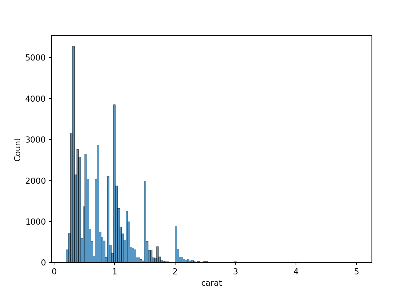
We have a range of carat values from 0 to 5 - although only 0 to 3 show up on the histogram, there are bound to be a few outliers. Now we will look at the range for depth.
sns.histplot(diamonds['depth'])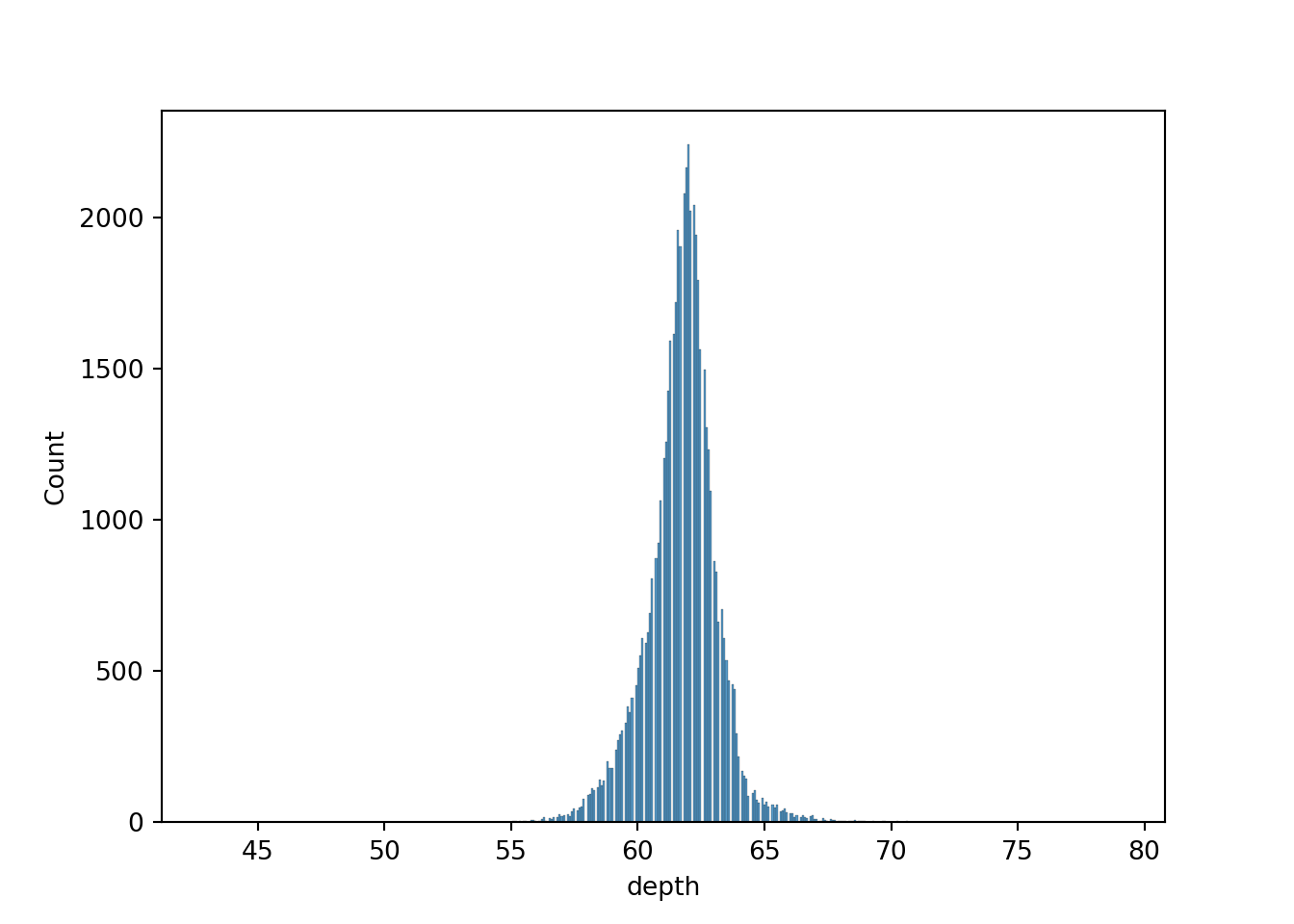
This time we are measuring in mm, and the range is from roughly 45 mm to 80 mm. If we superimpose the two histograms, we can see the following:
sns.histplot(diamonds['carat'])
sns.histplot(diamonds['depth'])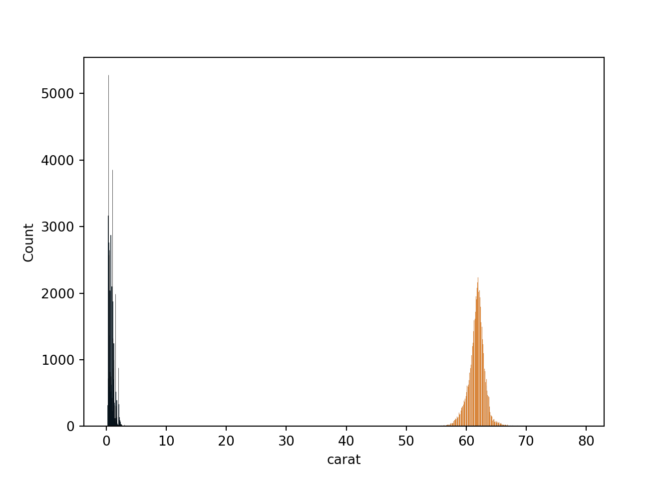
These values aren’t overlapping on the histogram, because the metrics we are using are completely different. The model will take into account these different units and it will think that depth has a higher importance than carat just because the values are higher.
When we use a “normal” linear regression we don’t need to use feature scaling bit when using ridge and lasso this is something we will need to take into consideration as they are very sensitive to the magnitude of the predictors. Scaling involves putting all of the predictors on one scale and there are a few different methods to do this.
2.24 MinMaxScalar
Min-Max scaling is a technique in which values are shifted and rescaled, so they end up ranging between 0 and 1.
from sklearn.preprocessing import MinMaxScaler
norm = MinMaxScaler()
# fit scaler on training data - here it will identify the min and max values from X_train and apply the formula
norm.fit(X_train)MinMaxScaler()In a Jupyter environment, please rerun this cell to show the HTML representation or trust the notebook.
On GitHub, the HTML representation is unable to render, please try loading this page with nbviewer.org.
MinMaxScaler()
# transform training data - this had to be done separately to the testing data, because you want to have Xmin and Xmax from
# the training dataset
X_train_norm = norm.transform(X_train)
# transform testing data
X_test_norm = norm.transform(X_test)Now, we can see that all the values for X_train_norm and X_test_norm are all between 0 and 1.
X_train_normarray([[0.29313929, 0.52571429, 0.33333333, 0.69739292, 0.23647799,
0.67048711],
[0.03534304, 0.5 , 0.41666667, 0.4255121 , 0.14465409,
0.40401146],
[0.02494802, 0.49428571, 0.33333333, 0.41247672, 0.14056604,
0.39111748],
...,
[0.17047817, 0.52571429, 0.44444444, 0.59776536, 0.20031447,
0.57163324],
[0.02079002, 0.52285714, 0.36111111, 0.39851024, 0.13584906,
0.38395415],
[0.28690229, 0.49428571, 0.38888889, 0.69646182, 0.23710692,
0.65902579]])X_test_normarray([[0.08523909, 0.44857143, 0.55555556, 0.51210428, 0.17075472,
0.46704871],
[0.06237006, 0.53142857, 0.36111111, 0.47020484, 0.15974843,
0.45415473],
[0.27234927, 0.47428571, 0.5 , 0.68994413, 0.23176101,
0.64183381],
...,
[0.07068607, 0.49142857, 0.38888889, 0.48882682, 0.16572327,
0.46131805],
[0.05405405, 0.5 , 0.33333333, 0.46275605, 0.15754717,
0.43982808],
[0.02079002, 0.55428571, 0.38888889, 0.39385475, 0.13396226,
0.38538682]])We can then use this scaled data in the Ridge Model. Sometimes it might improve the model but other times it doesn’t really have an effect on it. If it doesn’t have much of an effect, then it’s better to use the original data as the coefficients will be more relevant, but if it has a good effect on the model then it would be better to use the normalised data.
Ridge
model_norm_ridge = Ridge(alpha = 1)
model_norm_ridge.fit(X_train_norm, y_train)Ridge(alpha=1)In a Jupyter environment, please rerun this cell to show the HTML representation or trust the notebook.
On GitHub, the HTML representation is unable to render, please try loading this page with nbviewer.org.
Ridge(alpha=1)
model_norm_ridge.coef_array([47638.28950371, -6534.30539452, -3736.60311048, -9704.04308994,
3078.58531994, -975.29800004])print('Train r2 =', model_norm_ridge.score(X_train_norm, y_train))Train r2 = 0.8579240910376005print('Test r2 =', model_norm_ridge.score(X_test_norm, y_test))Test r2 = 0.8607547295087343The coefficients have changed, but the scores have remained the same. In the worse case, nothing will change if you use the Ridge technique - in the best case, you’ll get a better performance of the model.
Now we can see how the normalised data works on the lasso model.
Lasso
model_norm_lasso = Lasso(alpha = 1)
model_norm_lasso.fit(X_train_norm, y_train)Lasso(alpha=1)In a Jupyter environment, please rerun this cell to show the HTML representation or trust the notebook.
On GitHub, the HTML representation is unable to render, please try loading this page with nbviewer.org.
Lasso(alpha=1)
model_norm_lasso.coef_array([46482.20536684, -5945.77236272, -3379.89788963, -8250.78013895,
-0. , -262.86662866])print('Train r2 =', model_norm_lasso.score(X_train_norm, y_train))Train r2 = 0.857534903083864print('Test r2 =', model_norm_lasso.score(X_test_norm, y_test))Test r2 = 0.8606676253456835The score remains the same, although the model has cancelled different predictors this time around.
2.24.1 Standardisation
Standardisation is another scaling technique where the values are centred around the mean with a unit standard deviation. This means that the mean of the attribute becomes zero and the resultant distribution has a unit standard deviation.
This will standardise the values to be between -3 and +3, although if very large outliers were present this may change to -6 and +6.
from sklearn.preprocessing import StandardScaler
scale = StandardScaler()
scale.fit(X_train)StandardScaler()In a Jupyter environment, please rerun this cell to show the HTML representation or trust the notebook.
On GitHub, the HTML representation is unable to render, please try loading this page with nbviewer.org.
StandardScaler()
X_train_standard = scale.transform(X_train)
X_test_standard = scale.transform(X_test)X_train_standardarray([[ 1.70583791, 0.45477134, -1.10517827, 1.56238177, 1.58663619,
1.63667049],
[-0.90327685, -0.17519184, 0.24075375, -1.03438683, -1.0105053 ,
-1.03286178],
[-1.00848309, -0.31518365, -1.10517827, -1.15888944, -1.12613146,
-1.1620327 ],
...,
[ 0.46440427, 0.45477134, 0.68939775, 0.61082615, 0.56378937,
0.64636013],
[-1.05056559, 0.38477543, -0.65653427, -1.29228508, -1.25954626,
-1.23379432],
[ 1.64271417, -0.31518365, -0.20789026, 1.55348873, 1.60442483,
1.5218519 ]])# What do the outliers look like for X_train_standard?
pd.DataFrame(X_train_standard).sort_values(by = 0, ascending = False) 0 1 2 3 4 5
10339 8.859862 2.624645 0.689398 4.452621 4.272721 4.937705
29175 7.786759 2.834632 0.240754 3.999076 3.934737 4.564545
19148 7.008232 2.134673 1.586686 3.794536 3.659013 4.148327
24688 6.755737 -0.525171 1.586686 3.919038 3.881371 3.775167
9765 5.998253 3.744579 -2.002466 3.376563 3.329923 4.076566
... ... ... ... ... ... ...
7786 -1.260978 -1.365122 2.035330 -1.728044 -1.748734 -1.836592
31387 -1.260978 0.314780 -0.207890 -1.754723 -1.784311 -1.736126
35267 -1.260978 -1.925090 1.138042 -1.710258 -1.739840 -1.865297
13505 -1.260978 -0.175192 -0.207890 -1.710258 -1.748734 -1.736126
31046 -1.260978 -0.035200 1.138042 -1.745830 -1.793205 -1.764830
[37758 rows x 6 columns]# What do the outliers look like for X_test_standard?
pd.DataFrame(X_test_standard).sort_values(by = 0, ascending = False) 0 1 2 3 4 5
9066 6.755737 0.524767 2.035330 3.812322 3.739062 3.875633
13421 6.734696 1.084735 0.240754 3.803429 3.739062 3.976099
4430 6.040335 0.454771 -0.656534 3.670033 3.623436 3.717757
15517 5.682634 0.734755 -0.207890 3.483279 3.427760 3.574234
15235 5.472221 3.534591 -2.451110 3.278739 3.205402 3.918690
... ... ... ... ... ... ...
9831 -1.260978 -1.085139 2.035330 -1.728044 -1.766523 -1.822240
1343 -1.260978 -1.435118 -1.105178 -1.665793 -1.686474 -1.779183
4371 -1.260978 0.384775 1.138042 -1.781402 -1.828783 -1.764830
3229 -1.260978 -0.455175 0.689398 -1.710258 -1.739840 -1.750478
14354 -1.260978 -1.435118 2.035330 -1.683579 -1.722051 -1.807887
[16182 rows x 6 columns]We have some very large outliers in the dataset! We could consider anything around -3 to be an outlier, and it’s possible that these outliers could harm our model.
Ridge
model_stand_ridge = Ridge(alpha = 1)
model_stand_ridge = model_stand_ridge.fit(X_train_standard, y_train)model_stand_ridge.coef_array([ 5012.79474181, -305.88198594, -234.45013434, -1666.8130898 ,
313.57178367, 52.05750967])print('Train r2 =', model_stand_ridge.score(X_train_standard, y_train))Train r2 = 0.8583087598077588print('Test r2 =', model_stand_ridge.score(X_test_standard, y_test))Test r2 = 0.8606342518004511Lasso
model_stand_lasso = Lasso(alpha = 1)
model_stand_lasso = model_stand_lasso.fit(X_train_standard, y_train)model_stand_lasso.coef_array([ 4976.42816481, -296.66437104, -233.83111114, -1484.98256284,
218.71092298, -0. ])print('Train r2 =', model_stand_lasso.score(X_train_standard, y_train))Train r2 = 0.8582878293546289print('Test r2 =', model_stand_lasso.score(X_test_standard, y_test))Test r2 = 0.8610571748425837One issue with using the scaled data with Ridge and Lasso is that we aren’t really able to interpret the coefficients anymore as they have lost their meaning. For example, in our baseline diamonds model, we had the following coefficients:
array([10554.97807623,  -214.50311236,  -105.1861397 , -1489.91890779,
         280.71632526,    79.14284322])
So we could say that for a specific predictor, the price will increase by 10554.97… - these coefficients are in the scale of price, in US dollars. Now that the coefficients have been scaled, they don’t have meaning anymore and it can’t be converted back to the original data. So, if you wanted to just predict some prices then you would be able to use the scaled data; if you were interested in the coefficients you would have to use a ridge/lasso model without the scaled data.
2.24.2 Transform the target
We can transform the target variable as well as the predictors. Sometimes, this might make a large difference in our model. Below, we can see the distribution of the price of diamonds in the dataset - it is a big distribution with a long tail.
sns.histplot(diamonds['price'], kde = True)
Something we haven’t yet taken into consideration is the relationship between the target variable and the predictors might be wrong. For example, we might need to change the predictor to the log of the predictor, or the square root, etc. It can be common for there to be a logatrithmic relationship between the target variable and other predictors, so we can use a function called BoxCox. This function has a parameter, lambda, which will allow us to transform the target.
boxcox(data, lambda)
Some common values for lambda:
- lambda = -1. is a reciprocal transformation. It transforms each datapoint to its reciprocal \(\frac{1}{x}\).
- lambda = -0.5 is a reciprocal square root transformation. It transforms each datapoint to the reciprocal of its square root \({1}{\sqrt{x}}\)
- lambda = 0.0 is a log transformation, which applies the natural logarithm to each data point
- lambda = 0.5 is a square root transformation which transforms each data point to its square root \(\sqrt{x}\)
- lambda = 1.0 is no transformation and leaves the data unchanged.
from scipy.stats import boxcox

# using the boxcox function
price_transform = boxcox(diamonds['price'], 0) # log transformation
price_transform
array([5.78689738, 5.78689738, 5.78996017, ..., 7.92189841, 7.92189841,
7.92189841])The histogram of the price now looks like the following. This is good because when creating a linear regression, it’s ideal for the data to be as normally distributed as possible. This is a lot closer to a normal distribution than the previous histogram.
plt.hist(price_transform)
Now we can see how the relationship has changed between carat and price.
This is the original relationship:
# original relationship
plt.scatter(diamonds['carat'], diamonds['price'])
# transformed relationship:
plt.scatter(diamonds['carat'], price_transform)
The relationship seems to have improved - let’s rerun the model.
X = diamonds[['carat', 'depth', 'table', 'x', 'y', 'z']]
y = price_transform

X_train, X_test, y_train, y_test = train_test_split(X, y, test_size=0.3, random_state = 2021)

model_transf = LinearRegression()
model_transf = model_transf.fit(X_train, y_train)print('Train r2 =', model_transf.score(X_train, y_train))Train r2 = 0.9209675044047141print('Test r2 =', model_transf.score(X_test, y_test))Test r2 = 0.9270186680132368We now have a score of 92% for both the train and test scores. This is compared to 85 and 86 for the baseline model - a huge improvement!
To get the predicted values, we need to remember that these predictions will be in the transformed scale (we applied a log transformation). To interpret these predictions in the original scale of the ‘price’ variable we will need to reverse the BoxCox transformation. This will give us the predicted price values in the original scale.
y_pred = model_transf.predict(X_test)
y_pred_original_scale = np.exp(y_pred)
print(y_pred_original_scale)
[1859.28111723 1394.48553544 9588.07743222 ... 1632.78476234 1290.17934164
633.71576054]Note: if you’re not sure what value of lambda to use, try the following:
# instead of:

price_transform = boxcox(diamonds['price'], 0) # log transformation

# perform Box-Cox transformation on original data
price_transform, best_lambda = boxcox(diamonds['price'])
print(best_lambda)-0.06699029639889868Then, choose the value of lambda which best_lambda is closest to out of -1, -0.5, 0, 0.5 and 1. In this case it is 0, which is the original value of lambda we chose anyway.